As we unravel the power of using Python in Excel, we have covered some ground from understanding the basics to getting our hands dirty with time-series data analysis. Building upon that foundation, today we will take a plunge into the world of stock data analysis within the comfortable confines of Excel.
Why Stock Data Analysis?
In a world driven by data, the financial market is no different. Analyzing stock data efficiently can be the key to unlocking potential investment opportunities and steering clear of financial pitfalls. Excel, being the powerful tool that it is, provides a familiar environment to many professionals. Combine that with the analytical prowess of Python, and you have a potent toolset at your disposal.
Setting the Stage
Before we dive in, it’s highly recommended that new readers familiarize themselves with the essentials covered in the previous posts of this series. Here are quick links to those articles:
Having a strong foundation will help you make the most of the advanced techniques we are about to explore.
Data Ingestion
For this exercise, let’s assume we have some time-series stock data available in this Excel file. Time-series data is a sequence of data points in chronological order that is used by businesses to analyze past data and make future predictions. These data points are a set of observations at specified times and equal intervals, typically with a date-time index and corresponding value. Common examples of time-series data in our day-to-day lives include:
- Temperature measurements taken at regular intervals
- Total monthly taxi rides over a range of months
- A company’s stock price, recorded daily in 2021
To demonstrate the use of pandas for stock analysis, we will be using Amazon stock prices from 2013 to 2018. It is important to point out here that Anaconda seamlessly incorporates the Anaconda Distribution for Python into Excel. This integration not only brings fundamental Python capabilities but also grants access to a curated selection of more than 400 packages.
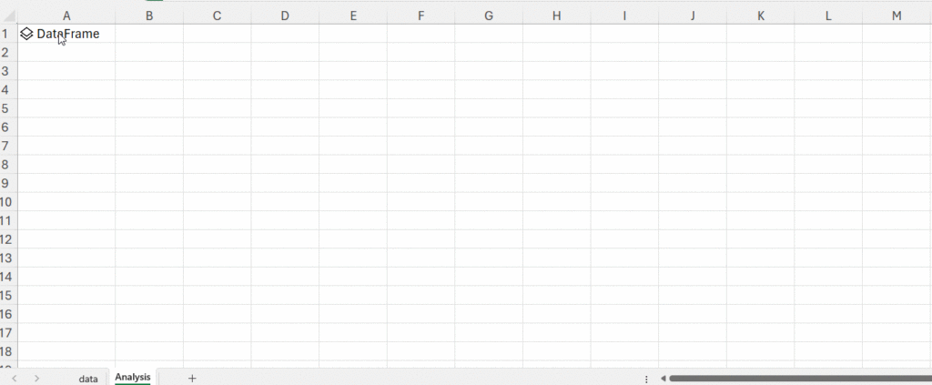
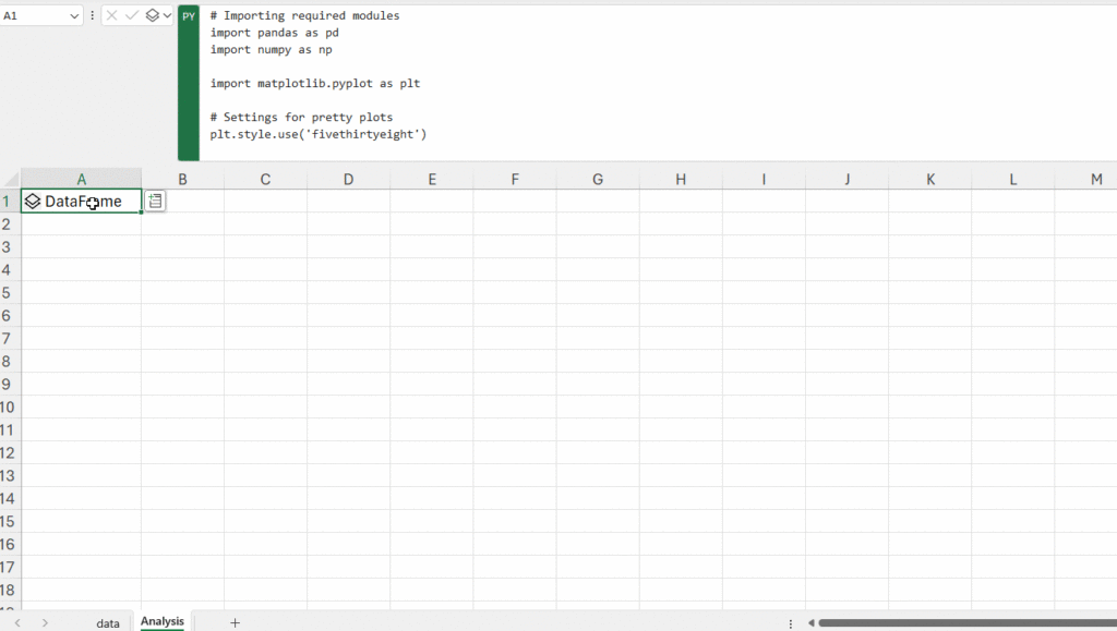
Let’s begin the data analysis process. We already have the data in a workbook (named “data”) and want to read it into a pandas DataFrame. We’ll create a new sheet called “Analysis,” in the same workbook, and enter: =py in an Excel cell, followed by the given code:
# Importing required modules
import pandas as pd
import numpy as np
import matplotlib.pyplot as plt

# Settings for pretty nice plots
plt.style.use('fivethirtyeight')
# Read in the data as a DataFrame
data = xl("data!A1:I1317", headers=True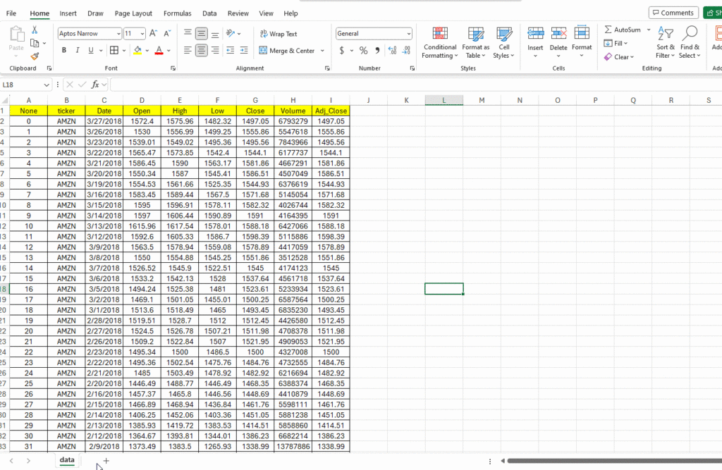
In this example, you’ll read data from the specified range “data!A1:I1317” on the “data” tab. The “headers=True” argument indicates that the first row contains column headers, allowing Excel to create pandas DataFrame with proper column names.
The Power of DataFrames
Before moving further, let’s spend some time on the concept of a DataFrame. A DataFrame is a two-dimensional data structure, akin to an Excel table. But in the context of Python, it’s an object within the powerful pandas library. When you interact with Python in Excel, you’re primarily working with DataFrames, making it the default object for two-dimensional ranges.
When a DataFrame is created or processed in Excel with Python, it can be visualized in two main ways:
- As a Python Object: The cell will display the term DataFrame preceded by a card icon. By selecting this card icon or using Ctrl+Shift+F5, you can view the data within the DataFrame.
- Converted to Excel Values: Instead of viewing it as a Python object, you can also output the DataFrame directly as Excel values. This is especially useful if you want to perform further Excel-specific operations on the data, such as creating charts or using Excel formulas.
Tip: Easily toggle between these visualizations using the Python output menu or the shortcut Ctrl+Alt+Shift+M.
Python Meets pandas in Excel: Analyzing Data with pandas
Leveraging the DataFrame concept, we can use the powerful pandas library to get insights.
Let’s start by looking at the first few columns of the dataset:
# Inspecting the data
data.head()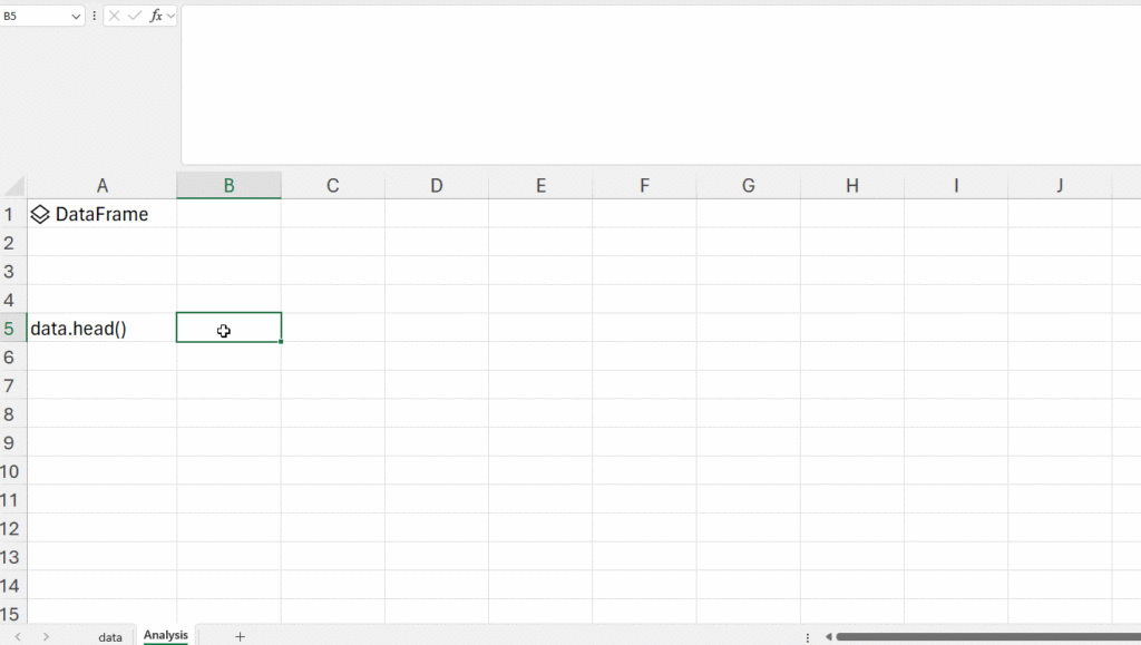
You can then decide to display this data as a Python object or Excel value based on your requirements. Let’s get rid of the first two columns, as they don’t add any value to the data.
data.drop(columns=['None', 'ticker'], inplace=True)
data.head()
Next, we’ll use the pandas to_datetime() feature, which converts the arguments to dates.
# Convert string to datetime64
data['Date'] = data['Date'].apply(pd.to_datetime)
Lastly, we want to make sure that the ‘date’ column is the index column.
data.set_index('Date', inplace=True)
data.head()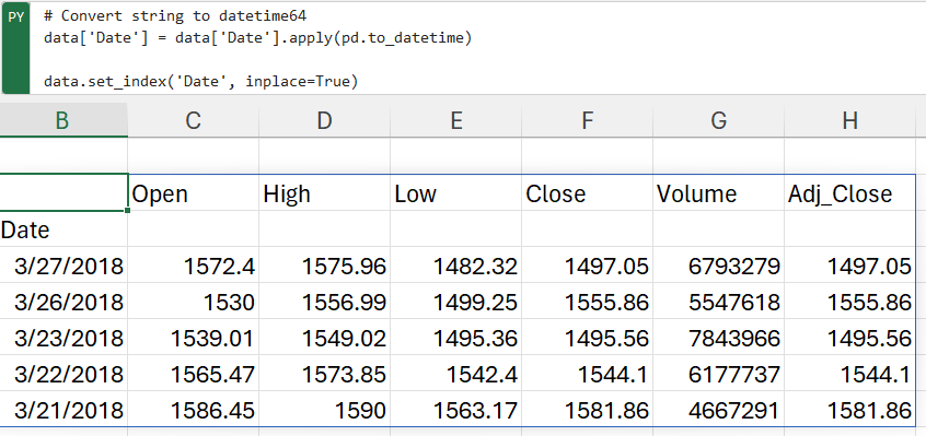
Now that our data has been converted into the desired format, let’s take a look at its columns for further analysis.
- The Open and Close columns indicate the opening and closing price of the stocks on a particular day.
- The High and Low columns provide the highest and the lowest price for the stock on a particular day, respectively.
- The Volume column tells us the total volume of stocks traded on a particular day.
The Adj_Close column represents the adjusted closing price, or the stock’s closing price on any given day of trading, amended to include any distributions and/or corporate actions occurring any time before the next day’s opening. The adjusted closing price is often used when examining or performing a detailed analysis of historical returns.
Visualizing Data within Excel
With the integration of Python in Excel, we can harness the visualization capabilities of renowned Python libraries like seaborn and matplotlib directly within Excel. Let’s visualize the adjusted closing price to get an understanding of the closing price pattern over time.
data['Adj_Close'].plot(figsize=(16,8),title='Adjusted Closing Price')
By default, visualizations are returned as image objects. Here’s how you can work with them:
- Preview: Click the card icon on the image object cell.
- Embed in Excel: Use the Python output menu to convert the image object to an Excel Value.
- Resize & Reposition: Use the Create Reference button to generate a floating copy of the image that can be adjusted as needed.
It appears that Amazon had a more or less steady increase in its stock price over the 2013-2018 window. We’ll now use pandas to analyze and manipulate this data to gather additional insights.
Advanced Analysis: Time Resampling
In the realm of financial institutions, where spotting market trends is paramount, examining daily stock price data isn’t always practical. To address this, a process known as time resampling is employed, which aggregates data into defined time periods like months or quarters. This allows institutions to gain an overview of stock prices and base their decisions on these trends.
The pandas library provides a resample() function for this purpose, which functions akin to the groupby method by grouping data based on specific time spans. The resample() function is implemented as follows:
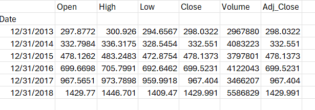
data.resample(rule = 'A').mean()In summary:
- data.resample() is used to resample the stock data.
- The A stands for year-end frequency and denotes the offset values by which we want to resample the data.
- mean() indicates that we want the average stock price during this period.
The output takes the form of average stock data displayed for December 31 of each year.
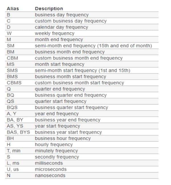
A comprehensive list of offset values can be found in the pandas documentation as shown below:
Time sampling can also be utilized to generate charts for specific columns. For instance:
data['Adj_Close'].resample('A').mean().plot(kind='bar',figsize = (10,4))
plt.title('Yearly Mean Adj Close Price for Amazon')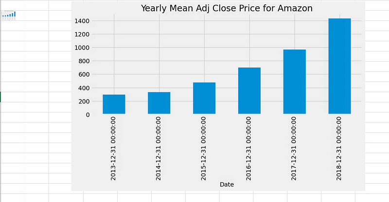
The bar plot above illustrates Amazon’s average adjusted closing price within our dataset at the end of each year. Similarly, you can find the monthly maximum opening price for each year.
Advanced Analysis: Rolling Windows
Time series data often contains substantial noise due to market fluctuations, making it challenging to discern trends or patterns. Consider this visualization of Amazon’s adjusted close price over the years:
data['Adj_Close'].plot(figsize = (16,8))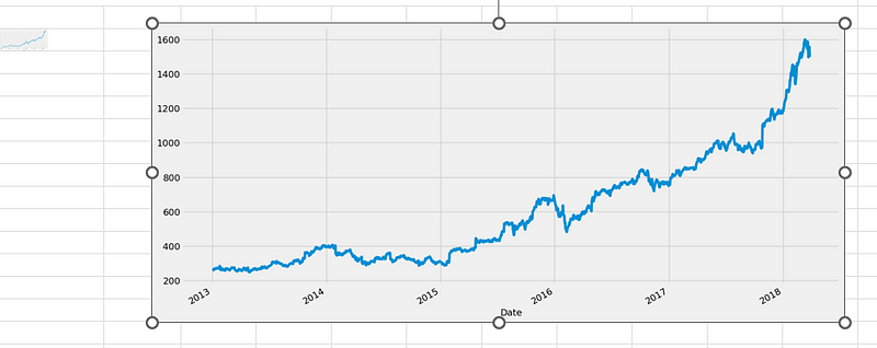
Given the daily data frequency, significant noise is apparent. It would be advantageous to smooth this noise, which is where a rolling mean becomes valuable. A rolling mean, also known as a moving average, is a transformation technique that mitigates noise in data by splitting and aggregating it into windows using various functions like mean(), median(), count(), etc. In our example, we will employ a rolling mean for a 7-day window:
data.rolling(7).mean().head(10)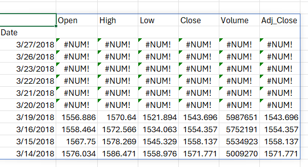
The output reveals that the first six values are blank, as there was insufficient data to calculate the rolling mean over a 7-day window.
So, what are the key advantages of calculating a moving average or using the rolling mean method? It significantly reduces noise in our data, making it more indicative of underlying trends than the raw data itself. Let’s visualize this by plotting the original data followed by the 30-day rolling data:
data['Open'].plot()
data.rolling(window=30).mean()['Open'].plot(figsize=(16, 6))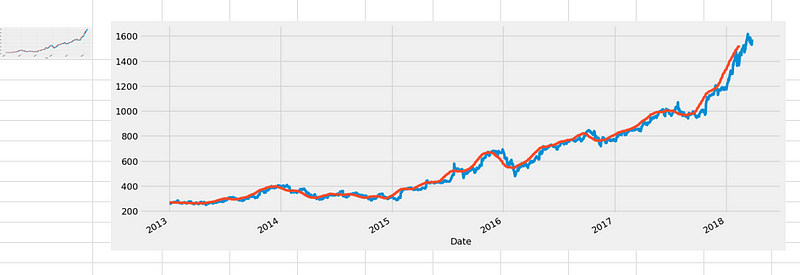
In the above plot, the blue line represents the original open price data, while the orange line represents the 30-day rolling window data, which exhibits less noise. It’s worth noting that the first 29 days won’t have the orange line since there wasn’t sufficient data to calculate the rolling mean during that period.
In this exploration of Python’s integration with Excel for stock data analysis, we’ve uncovered the power of combining Excel’s familiarity with Python’s analytical capabilities. We’ve learned how to efficiently read and manipulate stock data, visualize it within Excel using Python libraries like seaborn and matplotlib, and employ advanced techniques such as time resampling and rolling windows to gain deeper insights into financial trends. This article demonstrates that Excel, when enhanced with Python, offers a seamless and intuitive platform for data analysts, unlocking the ability to make informed decisions and uncover valuable insights from complex financial datasets.
Parul Pandey is principal data scientist at H2O.ai, specializing in cutting-edge AI advancements at the crossroads of product and community. As co-author of Machine Learning for High-Risk Applications, her work emphasizes responsi