The new Python in Excel integration by Microsoft and Anaconda grants access to the entire Python ecosystem for data science and machine learning. Thanks to its direct connection to Anaconda Distribution, we can leverage built-in functionality with packages like NumPy, pandas, Seaborn, and scikit-learn directly within our Excel workbooks. This post will explain a simple use case for creating your first machine learning experiment in Excel. We will showcase a few of the most common steps performed in a machine learning experiment (e.g., data partitioning, feature analysis), translating common Python tasks to an Excel workbook.
Note: To reproduce the examples in this post, install the Python in Excel trial.
Getting Started: The Dataset
Getting started with your first machine learning experiment in Excel is super easy! You just need Excel, with the new Python in Excel integration installed. You do not need to have Python already installed on your computer, nor have a special environment set up with specific packages. All the Python code embedded in Excel cells will be automatically committed and run in a sandboxed environment hosted on Microsoft Azure cloud. This environment is provided by Anaconda, giving you immediate access to the most popular Python stack for data science and machine learning.
Let’s start by opening a new, empty Excel workbook named My first Machine Learning Experiment.xlsx.
To get our bearings with the new Python in Excel integration, we will first write some simple Python code to display information about our Python environment.
Show Python Environment Information
In the top left cell (A1), let’s create a title for what we are going to display in cell A2. Something like “Python Environment Info.”
Let’s now move on to another cell (e.g., B1) and type “=PY” to create our first Python cell. Alternatively, you could use the Ctrl+Shift+Alt+P keyboard shortcut. Let’s now write the following Python code:
import joblib
import sklearn
import numpy as np
import pandas as pd
import sys

env_info_details= f"""
    Python: {sys.version[:6]}  # we will just retain version number info
    numpy: {np.__version__}
    pandas: {pd.__version__}
    scikit-learn: {sklearn.__version__}
    Available CPUs: {joblib.cpu_count()}
"""
env_info_details
In the code, we are collecting information on the version of the Python we are running, along with the versions of the NumPy, pandas, and scikit-learn packages available in the environment and the total number of available cores. For simplicity, we store this information in the env_info_details variable, which is defined as a multi-line f-string variable for quicker formatting.
If we commit the code by hitting Ctrl+Enter, we will trigger its execution. The following output should be generated:
Python 3.9.10
numpy: 1.23.5
pandas: 1.5.3
scikit-learn: 1.2.1
Available CPUs: 1
💡 Note 1: If the Python output does not appear formatted on multiple lines, this is due to the fact that the Excel cell formatting rule is not set to allow “wrapping” of text. This is because cell formatting and Python generate output are two separate concepts in Excel. In other words, Excel cell formatting properties will always overrule any Python formatting.
💡Note 2: You may have noticed that we did not use the Python print function to generate the output of a cell, but rather we returned the env_info_details string variable. This is because the use of the Python print function in Excel is limited to diagnostics information (accessible via Formulas > Python > Diagnostics). Conversely, if we were returning a string (i.e., str object) as a result of the cell, that object would be converted as Excel output and displayed. And that is exactly what we are doing with our first Python snippet.
From our first example, we can see that our environment is running on Python 3.9 and scikit-learn==1.2.1 (more info on this version is available in the corresponding release notes).
Load the Machine Learning Dataset
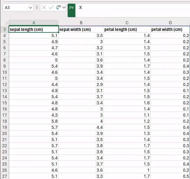
Let’s now focus on the dataset we will be using throughout our experiment. We will be working with a classic, namely the Iris dataset. This is perhaps one of the best-known databases in machine learning literature, and it is widely adopted as a reference example for machine learning experiments. For this reason, the dataset is automatically integrated in many libraries and tools for machine learning. scikit-learn provides access to a copy of this dataset in its datasets package: sklearn.datasets.load_iris.
In case you are not familiar with the dataset: We are going to work with a collection of 150 samples of iris flowers, each characterized by a set of four different features, namely sepal length, sepal width, petal length, and petal width. Each iris sample belongs to a single species: Setosa, Versicolor, or Virginica. The machine learning task is to automatically classify all the iris samples.
Similar to what we did for our Python environment, let’s now gather information about the dataset as available in scikit-learn. Let’s write the following code in a newly created Python cell.
In my example, I will be writing in cell D1, but please feel free to organize the contents of your spreadsheet as you see fit.
from sklearn.datasets import load_iris
iris = load_iris(as_frame=True)

X = iris.data
y = iris.target

ds_info_details = f"""
    {X.shape[0]} samples
    {X.shape[1]} features
    {y.values.ndim} target
"""
ds_info_details
You should see the following output:
150 samples
4 features
1 target
Great! Time to view this data directly in Excel!
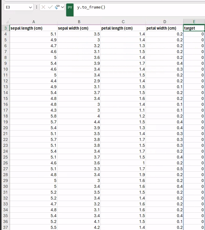
In our previous code snippet we created the Python objects, holding reference to both features and targets, namely X and y variables. Thanks to the as_frame=True parameter passed into the load_iris scikit-learn function, the two datasets are returned as pandas.DataFrame objects.
The Python in Excel integration has built-in functionality with DataFrame objects that can be easily displayed (“spilled” in Excel terminology) across multiple cells.
In fact, if we move to an empty cell (e.g., A3) and we create a new Python formula (i.e., =PY) that only includes a reference to the X variable, and then we hit Ctrl+Enter to run, the entire dataset will be displayed:
Similarly, we can display the corresponding targets next to the features (e.g., in the E3 cell, to avoid overlaps) by typing the following Python formula:
y.to_frame()You can see the final output in the figure below.
Brilliant! 🎉
Now we have our dataset integrated into our Excel workbook directly via Python! This is one of the great benefits of having access to Python directly in our workbook: we can integrate both code and data into Excel.
It is worth emphasizing that everything explored in this post can be similarly applied to any dataset already available in Excel.
Before moving to the next section, let’s first rename the current worksheet to be more meaningful, e.g., Dataset. When working in an Excel workbook, we can better organize our experiment into multiple spreadsheets, each dedicated to a single step in our experiment.
Step 1: Data Partitioning
Now the machine learning experiment truly begins. To get started, you’ll begin with data partitioning. We will create two distinct data partitions from our original dataset that will be used for training and testing our machine learning model.
So, let’s create a new spreadsheet in our workbook named Step 1 – Data Partitioning.
To create our training and test data partitions, we can use the train_test_split utility function included in scikit-learn, similar to what we would have done if we were running our code in a Jupyter notebook. And similarly to notebooks, the underlying execution model assumes a global namespace shared among each cell. In Excel workbooks in particular, this assumes an execution order that begins in the top-left cell of the first worksheet and proceeds in a row-major fashion. This means that any variable, function, or Python object defined in a cell is also visible and accessible from all cells that are next in the execution order.
In the previous section, we created the references to our features and targets data, referenced by the X and y variables as pandas.DataFrames. We can then reference those same variables in our new worksheet and generate our data partitions.
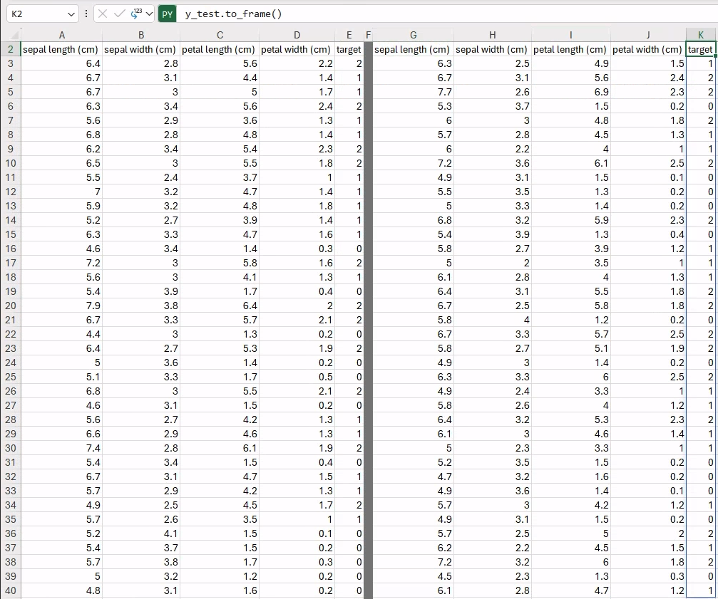
Let’s create a new Python cell (e.g., in A2) where we will add the following code:
from sklearn.model_selection import train_test_split

X_train, X_test, y_train, y_test = train_test_split(X, y,
                                                    random_state=12345,
                                                    stratify=y)
X_train
Now, our namespace contains four new variables: X_train, y_train, X_test, and y_test, holding reference to the features and targets for training and testing, respectively. The current cell only returns the X_train DataFrame that will be spilled to neighboring cells. We can now proceed to fill in the other data in a similar fashion as in the previous section to visualize the entire dataset, as follows:
y_train.to_frame()  # e.g., in cell E2
X_test              # e.g., in cell G2
y_test.to_frame()   # e.g., in cell K2
Thanks to the fixed random seed (i.e., random_state=12345) and the default value used for test_size=0.25, you should be getting exactly the same results, with a total of 112 and 38 samples in the training and test partitions.
Step 2: Feature Analysis
Let’s now explore our data by visualizing our pairwise distribution of features in both the training and test partitions.
Let’s start by creating a new spreadsheet, named using the same convention as the previous section: Step 2 – Feature Analysis. In this way, we will keep our workbook organized, with a single spreadsheet for each step of our experiment.
To quickly generate and visualize the pairwise distribution of features, we can use the seaborn.pairplot function. We already have our data in the form of a DataFrame, so we only need to join features and corresponding targets together, as the pairplot function is expecting a single DataFrame object. Also, we would likely need to repeat the same operations to visualize feature distributions for both training and test data. Therefore, it would be wise to write a function that we can call multiple times with different data.
Let’s now create a new Python cell (e.g., in A1), with the following code:
import seaborn as sns
from matplotlib import pyplot as plt

def feature_plot(X, y, title):
    as_df = X.join(y)  # join features, and targets
    pplot = sns.pairplot(as_df, hue="target", markers=["o", "s", "D"],
                        diag_kind="hist", palette="tab10")
    pplot.fig.suptitle(title, y=1.04)
    return pplot

# merely return to have a label as cell output
"feature_plot function definition"
As you may have noticed, after the feature_plot function definition, we are defining a Python string, i.e., “feature_plot function definition.” This is a useful trick to label the content of a Python cell not producing any direct output. This cell just defines the Python function that will be reused later in other formulas.
Let’s now call the new feature_plot function in a new Python cell (e.g., in B1), for training data:
feature_plot(X_train, y_train, title="Training Set - Feature Plot")By default, the image will be automatically embedded within the current cell. At this point you have two options:
- You can keep the image within the current cell, meaning you’ll need to increase its width and height to visualize it properly;
- OR you can detach the image from the current cell and drag it around the worksheet, as you would normally do with a standard image generated with Excel.
⚠️ Beware: If you detach the image from the current cell, all the Python code used to generate it will be lost, as the object will not be living within a Python cell anymore. At the time of writing, this behavior seems limited to cells having images as output.
For this reason, OPTION 1 is recommended, and will be used throughout this post.
In our case, this would not be a big deal as the only Python code we wrote was a function call. Therefore, the general takeaway lesson here is: Whenever your Python cell is expected to generate an image as per its output, better to limit the code in the cell to a mere function call to generate the figure, which has been defined elsewhere!
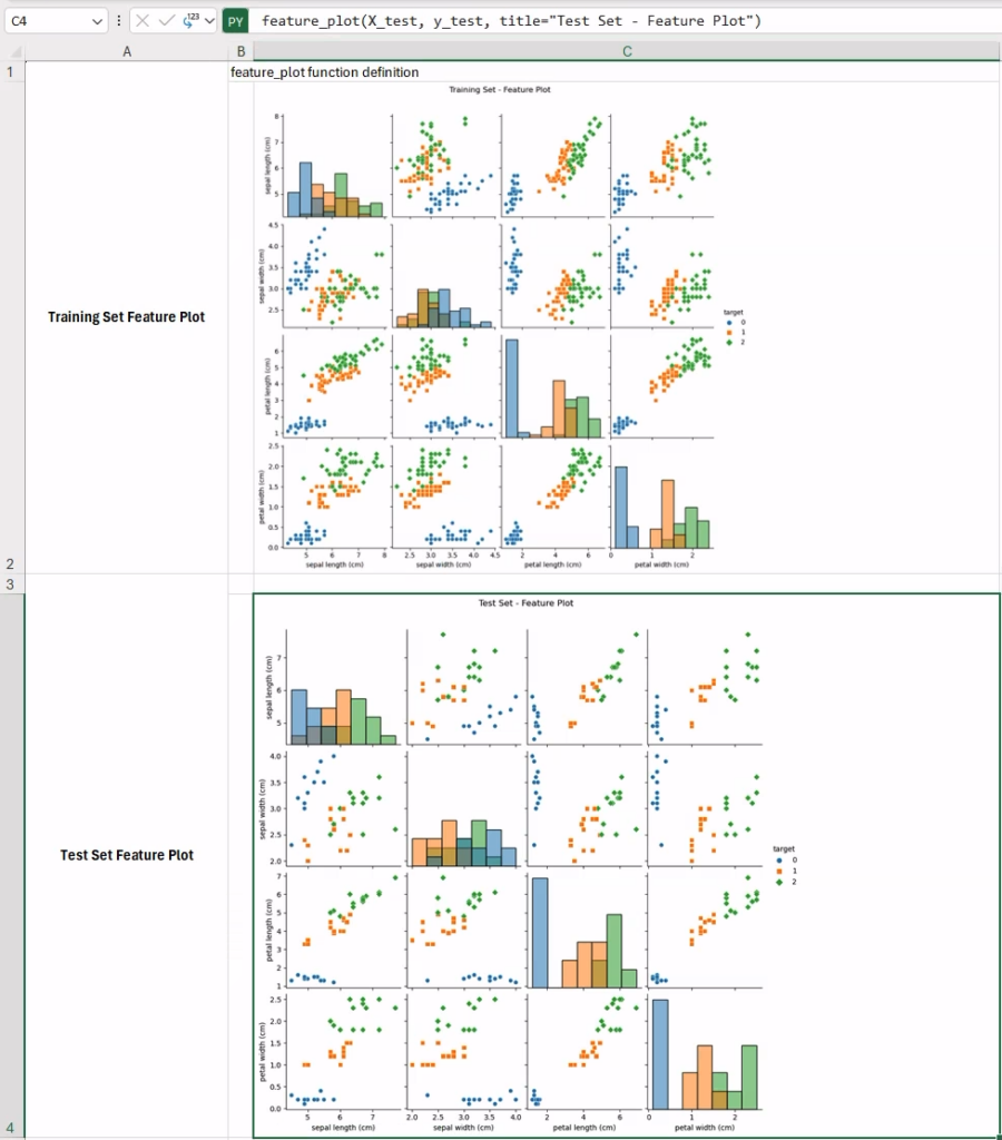
This is what the final feature plots should look like in your workbook. These plots are particularly informative, as they allow us to qualitatively assess how informative each pair of features would be in separating the three classes across the two partitions. In fact, some features seem particularly effective in distinguishing the various iris species (e.g., sepal length vs petal width, top-right corner in the training set data), while other pairs are less useful (e.g., sepal width vs sepal length ). In cases like this, one possibility would be trying to work on a lower-dimensional space (e.g., in 2D) using methods for dimensionality reduction.
Principal Component Analysis (PCA)
One of the most popular methods for dimensionality reduction is principal component analysis (PCA), which aims to find successive orthogonal components (i.e., dimensions) that explain a maximum amount of the variance. Let’s try PCA in Excel with our iris data.
This time, we are also going to try something new: Let’s write our code in a new Python cell (e.g., E1) and set up its output as a Python object (instead of the default “Excel value”). We will discuss the implications of this choice in a bit. Let’s focus now on the code snippet to include:
from sklearn.decomposition import PCA

pca = PCA(n_components=2)
pca.fit(X_train)
pca
The code itself is very simple: We first create a new PCA model, we fit the model on the training data, and we return the (trained) PCA model instance as cell output. By doing so, we can reference the model instance any time by simply referencing the Excel cell. (This will be useful in the next steps when we want to get direct access to the PCA model to scale the data).
Let’s now create some utility functions to scale the data and generate the plots in a new Python cell:
def scale_data(X, y):
    """Utility function to scale data, and join them into a unique data frame"""
    X_scaled = pca.transform(X)  # X_scaled is a numpy array
    X_scaled_df = pd.DataFrame(X_scaled, columns=["x1", "x2"])
    X_scaled_df["target"] = y.values
    return X_scaled_df

def plot_pca_components(X, y, title):
    """Utility function to visualize PCA components"""
    X_scaled_df = scale_data(X, y)
    pca_plot = sns.relplot(data=X_scaled_df, x="x1", y="x2",
                          hue="target", palette="tab10")
    pca_plot.fig.suptitle(title, y=1.04)
    return pca_plot

"plot_pca_components and scale_data function definitions"
The first function simply scales the data and returns it as a pandas.DataFrame for better integration with Seaborn, stacking together features and targets. The resulting data frame will be used in the plot_pca_components function to generate the relplot of the passed data.
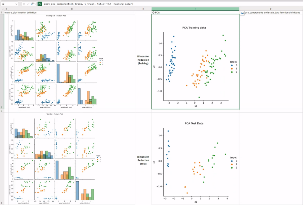
We will be calling the latter function on the (X_train, y_train) and (X_test, y_test) pairs to visualize the PCA components (in 2D) for training and test datasets, respectively.
The complete worksheet should look similar to what is shown in the figure below. As expected, working on lower-dimensional data could possibly help the classification model.
Step 3: Exploratory Clustering
After scaling our data, PCA helped in making more sense of it. Let’s see how a clustering algorithm (e.g., k-means) partitions our (scaled) data, and how these partitions map to the actual expected classes (i.e., the iris species).
Let’s create a new worksheet, named Step 3 – Exploratory Clustering.
First we need to generate a new k-means instance that will be trained on data preliminarily scaled with the PCA algorithm. To avoid repeating code and wasting computation, we can get direct access to the trained PCA model from the previous worksheet by directly referencing the Python cell with “Python object” output. To do so, we will be using the special xl() Python function.
Let’s create a new Python cell and set up its output as Python object:
from sklearn.cluster import KMeans

kmeans = KMeans(n_clusters=3, n_init="auto")
pca_model = xl("'Step 2 - Feature Analysis'!E1")  # reference the trained pca model
X_train_scaled = pca_model.transform(X_train)
kmeans.fit(X_train_scaled)
kmeans
Using the same “trick” as with the PCA model, we will return the trained k-means clustering model instance for later direct access.
Let’s now define our function to visualize the clustering partitions in a new Python cell:
def visualize_kmeans_clustering(X, y, title):
    cluster = xl("A1")
    X_scaled = scale_data(X, y)
    features = X_scaled[["x1", "x2"]]

    y_cluster = cluster.predict(features.values)
    X_scaled["cluster"] = y_cluster

    cluster_plot = sns.relplot(data=X_scaled, x="x1", y="x2",
                              hue="target", style="cluster", palette="tab10")
    cluster_plot.fig.suptitle(title, y=1.04)
    return cluster_plot

"visualize_kmeans_clustering function definition"  # as cell output
It is worth noting that we are referencing the cluster instance, selecting the previous cell via the xl() selector function (line 2: cluster = xl(“A1”)). Also, we are reusing the utility scale_data function defined in the previous section to scale the data with PCA and get the result as a data frame, ready to be used with Seaborn.
To finally visualize our clustering results, we will again rely on the seaborn.relplot function, but this time using an extra trick. The color of each element (point) will be determined by the actual expected class (i.e., hue=”target”), while the marker will be assigned based on the cluster label (i.e., style=”cluster”). In this way, we will be able to qualitatively assess how much homogeneity there is between the cluster labels and the expected classes.
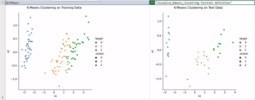
To verify this, let’s call the visualize_kmeans_clustering function in two new Python cells, with the aforementioned “catch” when displaying images as cell content. In the figure below, the clustering has been executed fairly successfully, with some confusion around a few samples in classes 1 and 2—namely “Versicolor” and “Virginica.”
Step 4: Iris Classification
We have finally reached the last step in our simple machine learning experiment, wherein we will train a classification model and generate a classification report.
Let’s get started by creating a new worksheet, named Step 4 – Iris Classification to work on our last code snippets for our experiment.
At this point, we have everything we need to train a classification model:
- We have training and test partitions, i.e., (X_train,y_train) and (X_test, y_test);
- we have access to a trained model for dimension reduction, i.e., PCA;
- and we have access to utility functions we can use to further inspect the data if necessary.
To generate an informative classification report, we should include the value of the classification metric (accuracy_score would be okay, in this case), along with the corresponding confusion matrix.
Let’s create a new Python cell, containing the following code:
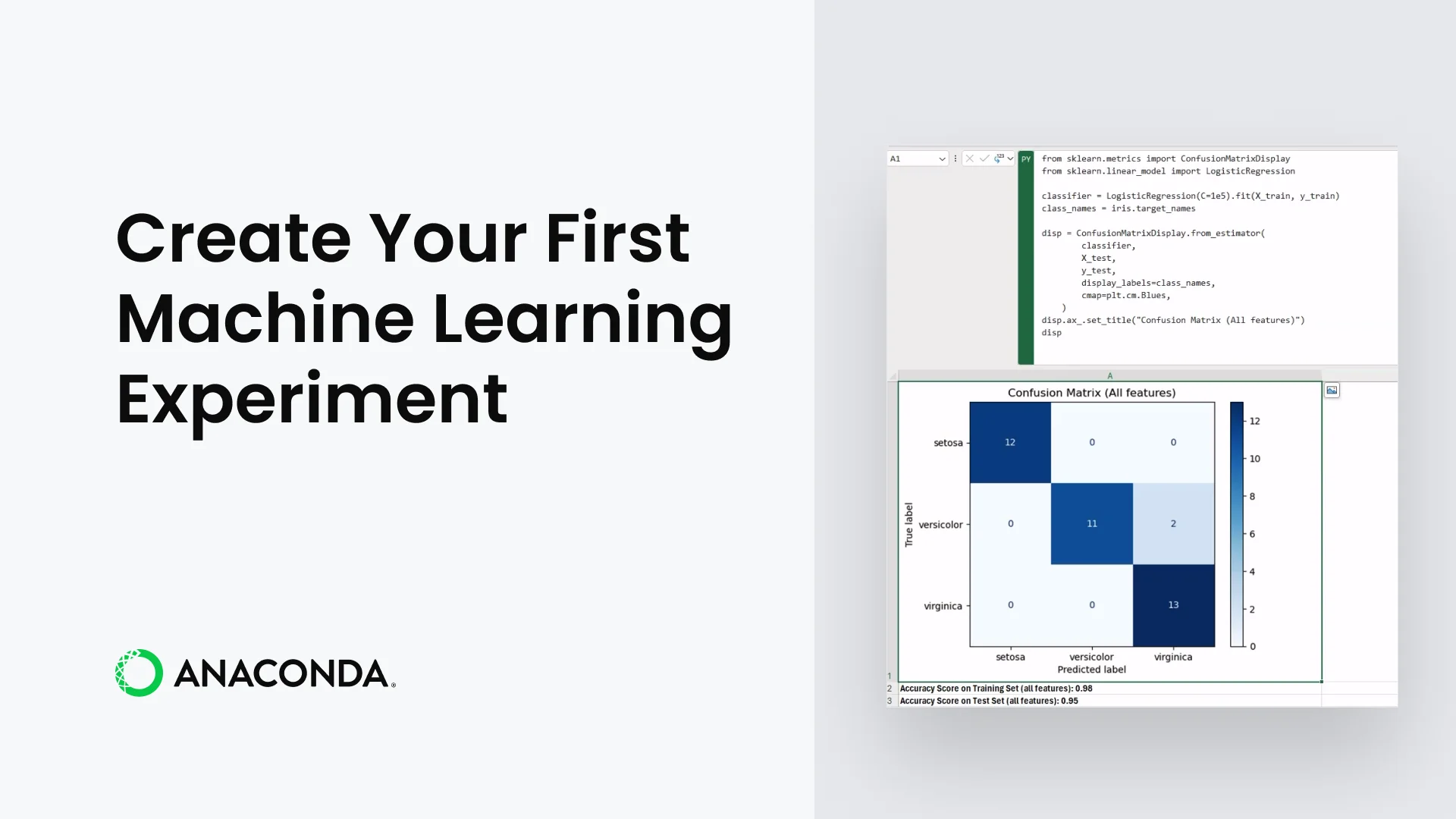
from sklearn.metrics import ConfusionMatrixDisplay
from sklearn.linear_model import LogisticRegression

classifier = LogisticRegression(C=1e5).fit(X_train, y_train)
class_names = iris.target_names

disp = ConfusionMatrixDisplay.from_estimator(
        classifier,
        X_test,
        y_test,
        display_labels=class_names,
        cmap=plt.cm.Blues,
    )
disp.ax_.set_title("Confusion Matrix (All features)")
disp
The classification model is a LogisticRegression, and the model should work reasonably well considering the data at hand. To display our confusion matrix, we use the ConfusionMatrixDisplay utility class in scikit-learn, which is able to generate the matrix given a trained classifier.
Once we have our trained classifier, printing the score results in other cells is as simple as calling the score method on the model instance, for both training and test data:
f"Accuracy Score on Training Set (all features): {classifier.score(X_train, y_train):.2f}"f"Accuracy Score on Test Set (all features): {classifier.score(X_test, y_test):.2f}"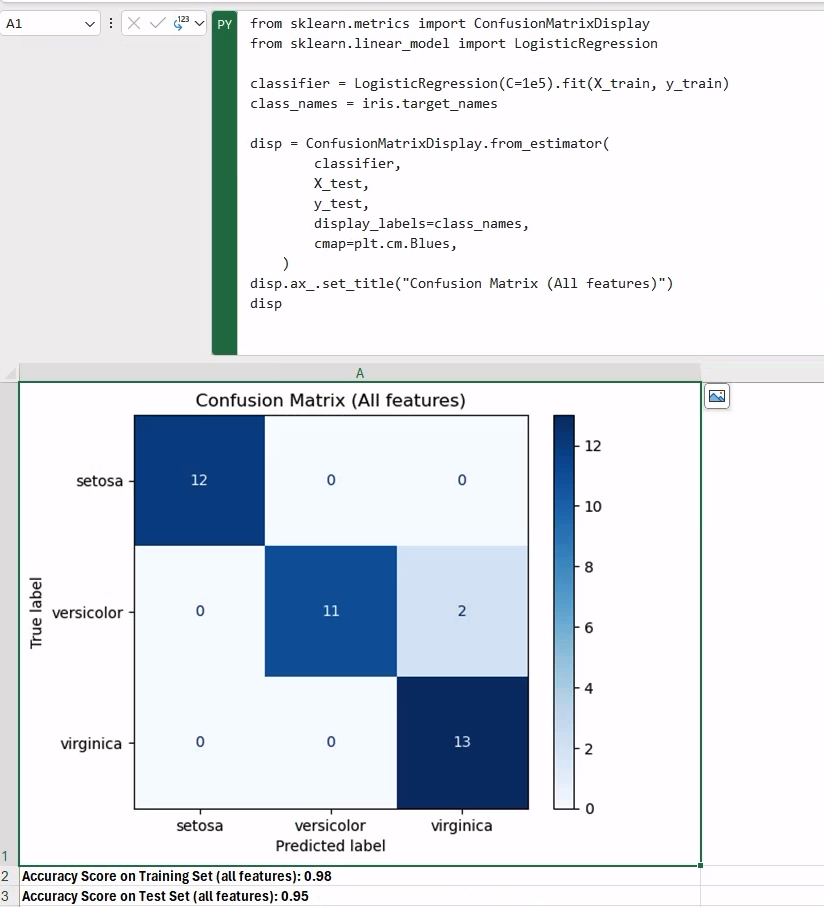
As an exercise, you could try replacing the X_train data with the 2D-scaled version using PCA to see how much that would change the performance.
Conclusion
In this blog post we explored how the new Python in Excel integration enables you to build a complete machine learning experiment within an Excel workbook using Python. We worked on multiple steps of a machine learning experiment (from data partitioning to the final classification report), leveraging the built-in integration with Anaconda Distribution, which provides direct access to popular tools and libraries for data science and machine learning—such as pandas, scikit-learn, and Seaborn.
The final version of the workbook created in this post is available here. Disclaimer: The Python integration in Microsoft Excel is in Beta Testing as of the publication of this article. Features and functions are likely to change. Don’t hesitate to reach out if you notice an error on this page.
Bio
Valerio Maggio is a researcher and data scientist advocate at Anaconda. He is also an open-source contributor and an active member of the Python community. Over the last 12 years he has contributed to and volunteered at many international conferences and community meetups like PyCon Italy, PyData, EuroPython, and EuroSciPy.