

Python in Excel
Aug 22, 2023
Introduction to Text Analysis with Python in Excel

Integrating Python with Excel stands as a groundbreaking plug-in that acts as a bridge connecting two popular but previously separate ecosystems. Seamlessly integrating Python code within an Excel workbook empowers us to leverage Python’s extensive libraries for data analysis and visualization right within Excel, making it an invaluable tool for data enthusiasts and analysts. In this blog post, we will explore how Python in Excel enables data visualization using Seaborn, a popular Python visualization library, without having to leave the Excel grid.
Note: To reproduce the examples in this post, install the Python in Excel trial.
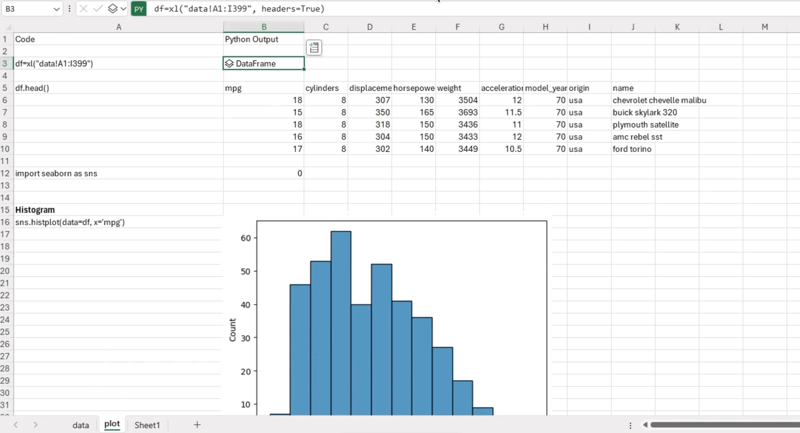
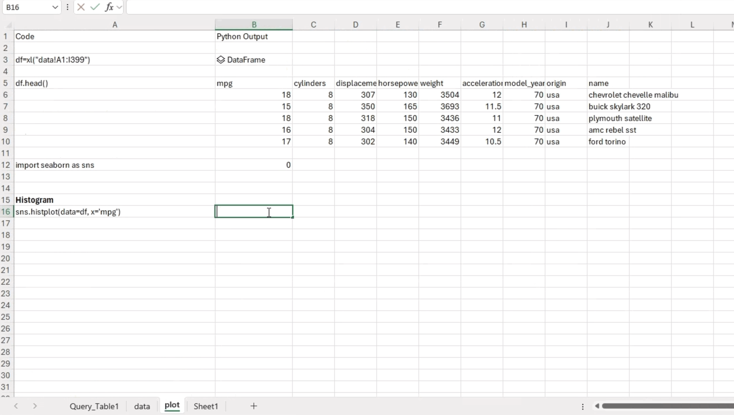
Using Python in Excel is remarkably simple. To write Python code in an Excel cell, all you need to do is begin your input with the “=py” prefix. For example, let’s say you have data in a “data” workbook and want to read it into a pandas dataframe. In the Excel cell, enter: =py(“. Then you can continue writing your Python code as you would in a regular Python environment. To read data from the “data” workbook and create a pandas dataframe, use the following syntax:
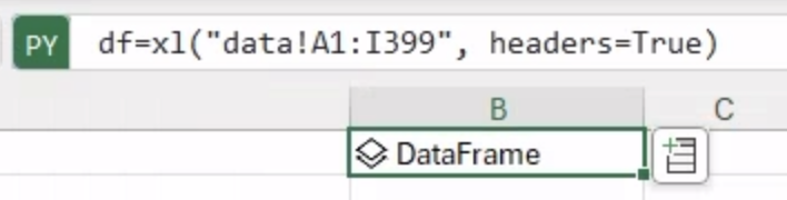
df = xl("data!A1:I399", headers=True)In this example, you’ll read data from the specified range “data!A1:I399” on the “data” tab. The “headers=True” argument indicates that the first row contains column headers, allowing Excel to create a pandas dataframe with proper column names.
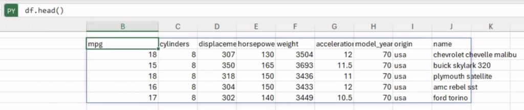
To examine the first five rows of the dataframe within Excel, you can execute the command “df.head()” directly. This example showcases a dataset containing the technical specifications of cars.
Seaborn is a data visualization library built on top of Matplotlib, another popular plotting library in Python. While Matplotlib provides a flexible foundation for creating static, interactive, and animated visualizations, Seaborn offers a higher-level interface that simplifies the process of generating informative and aesthetically pleasing statistical graphics.
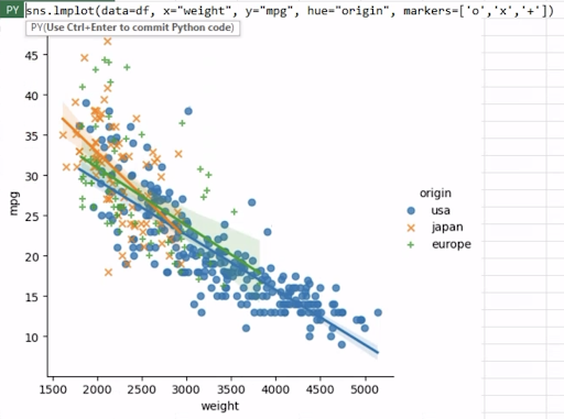
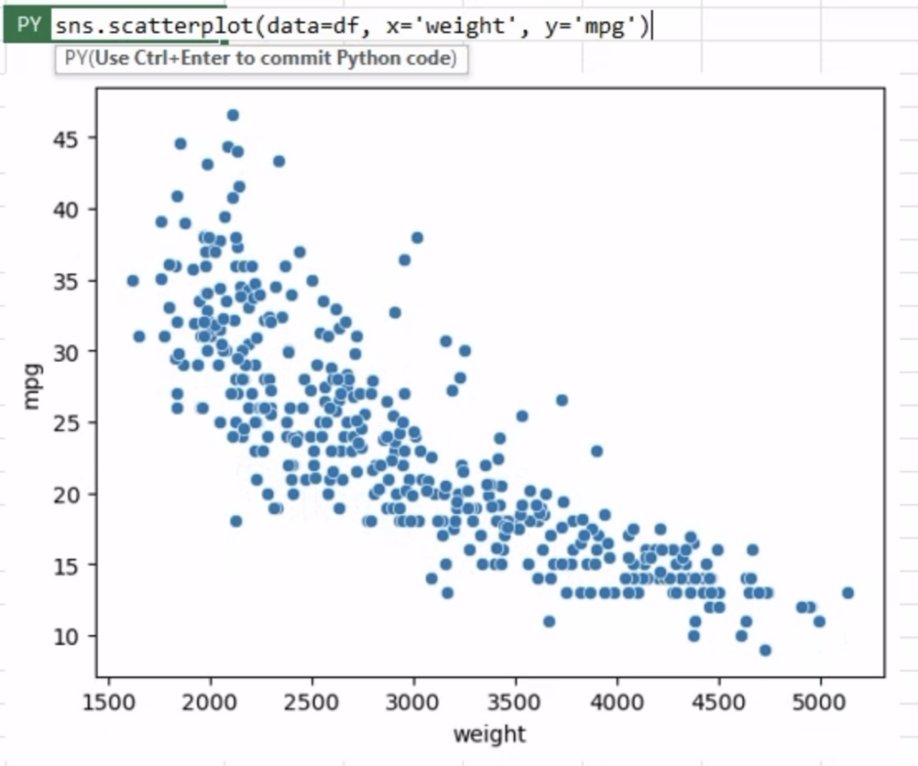
One of the primary reasons why Seaborn is favored is its user-friendly plotting syntax. With just a few lines of code, you can create visually stunning plots that would otherwise require much more effort using other libraries. Seaborn’s high-level functions allow us to quickly generate various types of plots, such as scatter plots, bar plots, histograms, box plots, and more, with minimal coding.
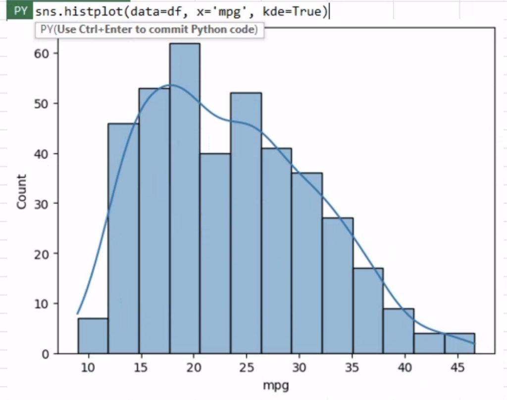
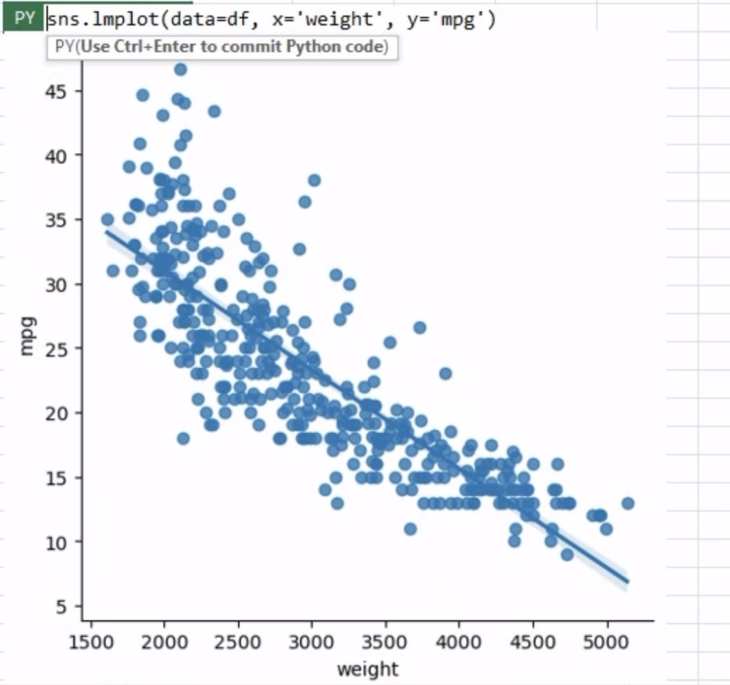
Seaborn excels at creating statistical plots that unveil valuable insights from complex datasets. By incorporating statistical estimation methods within its plotting functions, Seaborn can automatically compute and display essential summary statistics and fit linear regression models. This not only saves time but also provides more statistical insights of our visual representations.
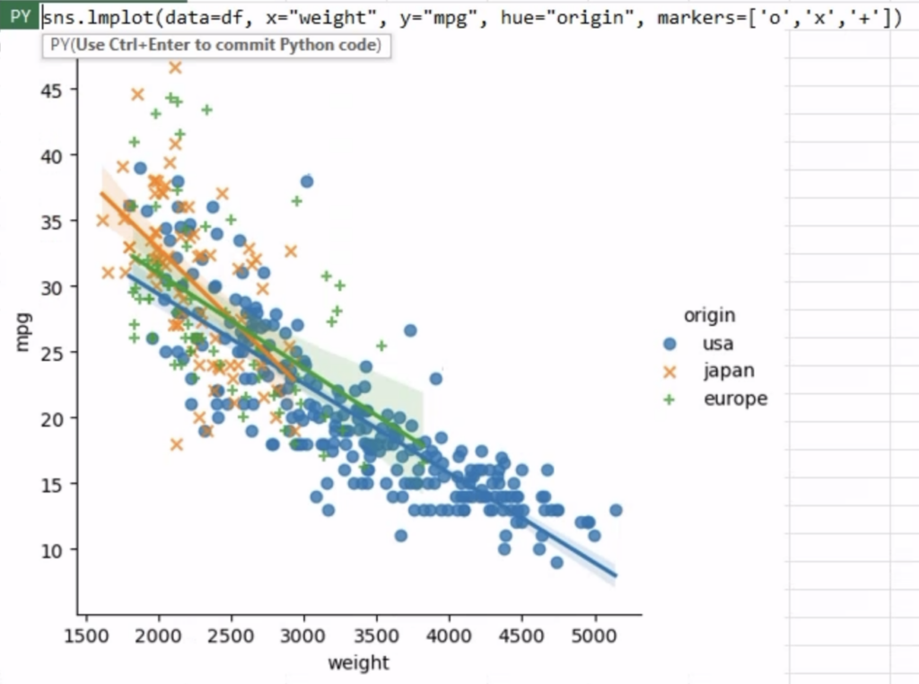
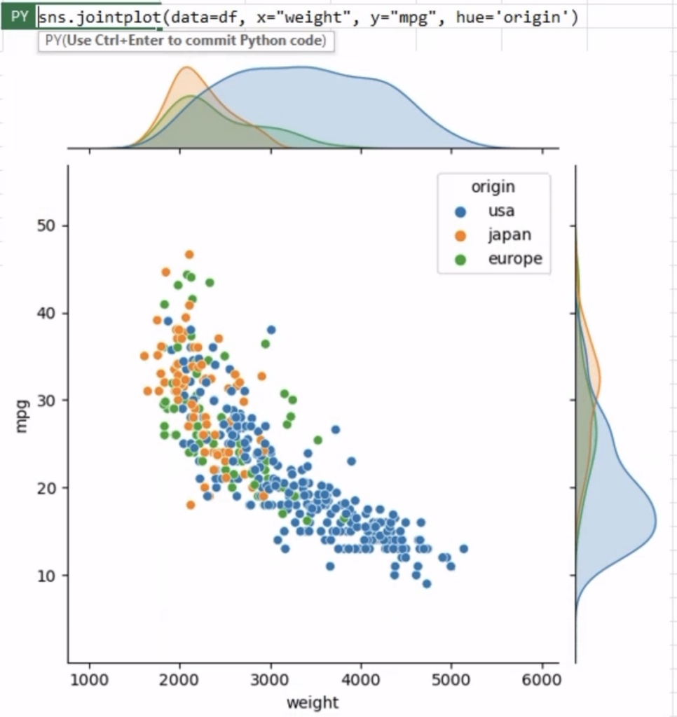
In data analysis, we often encounter datasets with multiple variables. Seaborn’s capabilities shine when it comes to visualizing relationships between multiple variables, both categorical and numeric. By utilizing features like jointplot() and pairplot(), Seaborn enables us to employ multiple kinds of plots from different modules to represent multiple aspects of a dataset in a single figure.
In conclusion, Python in Excel is a game changer for anyone who frequently works with data and relies on both Excel and Python. By combining the powers of Excel and Seaborn, you get easier access to powerful data analysis and can unlock the full potential of data-driven insights. So, why not dive into the world of Python in Excel and Seaborn to uncover hidden patterns and gain deeper insights from your data? Happy visualizing!
Want to do more with Python and Excel? Check out this blog post “From Notebooks to Workbooks: Data Reporting in Excel with Python.”
Want a deeper dive into visualizing data with Seaborn? Take this Introduction to Data Visualization with Python course.
Disclaimer: The Python integration in Microsoft Excel is in Beta Testing as of the publication of this article. Features and functions are likely to change. Don’t hesitate to reach out if you notice an error on this page.
Sophia Yang is a Senior Data Scientist and a Developer Advocate at Anaconda. She is passionate about the data science community and the Python open-source community. She is the author of multiple Python open-source libraries such as condastats, cranlogs, PyPowerUp, intake-stripe, and intake-salesforce. She serves on the Steering Committee and the Code of Conduct Committee of the Python open-source visualization system HoloViz. She also volunteers at NumFOCUS, PyData, and SciPy conferences. She holds an M.S. in Computer Science, an M.S. in Statistics, and a Ph.D. in Educational Psychology from The University of Texas at Austin.
Talk to one of our financial services and banking industry experts to find solutions for your AI journey.

