Visual Data Analysis with Python in Excel: Using Scatter Plots

Dave Langer

Dark blue background with a green gradient diagonal. In the top right corner 'Python in Excel' and the center has a green frame with the words 'Series: learning universal data analysis skills" inside.

This is the third in a series of blog posts that teach you to analyze data using Python code in Microsoft Excel visually.

If you are new to Python in Excel, you should start with my Python for Excel Analysts blog series, which covers many concepts that will be assumed in this blog series.

This series will use the Microsoft Excel Labs Python Editor to write code. However, the Python Editor is not required. All code can be entered using the Formula Bar and the new PY() function.

Each post in the series has an accompanying Microsoft Excel workbook to download and use to build your skills. This post’s workbook is available for download here.

For convenience, here are links to all the blog posts in this series:

Note: To reproduce the examples in this post, install the Python in Excel trial. If you like this blog series, check out my self-paced certification program, Anaconda Certified: Data Analysis with Python in Excel.

Introducing Scatter Plots

A common scenario in business analytics is investigating if there exists some relationship between two measures—for example, a relationship between advertising spend and sales.

In other words, a relationship between two columns of numbers.

As discussed in previous posts, it is possible to visually inspect columns of numbers if the columns are small. However, visual inspection of numeric data quickly breaks down as the columns become larger.

Visualizing two columns of numbers using scatter plots achieves the following goals:

  • It allows your analysis to scale to large columns of numbers.
  • Patterns and relationships in the data are much easier to detect and analyze.

A Contrived Example

Take the following collection of data as a contrived example: 

Fig 01 – A Contrived Example of Numeric Data

The data shown in Fig 01 are structured as follows:

  • Each row represents some period (e.g., months).
  • The ice cream sales and shark attack counts are recorded for each period.

While Fig 01 depicts a scenario where visual inspection of data could be performed and some insights can be derived, later examples in this post will demonstrate the power of scatter plots.

Your First Scatter Plot

The Python seaborn library provides several scatter plot-based visualizations. The following code loads the Excel table shown in Fig 01 as a pandas DataFrame and then visualizes the data as a scatter plot:

Fig 02 – Python Code for a Scatter Plot

Note: While the above Python code is written using the Excel Labs Python Editor, this is not required.

The code shown in Fig 02 leverages the seaborn scatterplot() function, with the visualization configured as follows:

  • The shark_attacks DataFrame is the data source.
  • The Ice Cream Sales column is mapped to the x-axis.
  • The Shark Attacks column is mapped to the y-axis.

Lastly, the set_title() method adds a title to the scatter plot.

The code cell is configured with the Convert to Excel values option by clicking the down arrow for the cell in the Python Code Editor. Selecting this option renders the scatter plot within the worksheet cell:

Fig 03 – Rendering the Scatter Plot Inside the Worksheet Cell

Clicking the disk icon tells the Python Code Editor to execute the Python code:

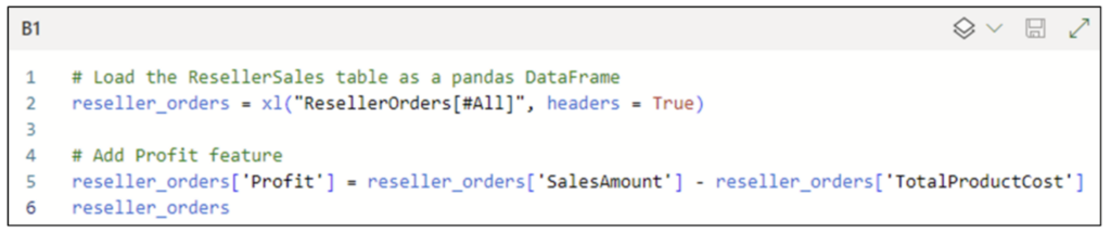
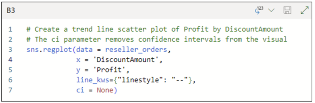
Fig 04 – Executing the Python Code

The code shown in Fig 02 produces the following scatter plot:

Fig 05 – A Scatter Plot of Shark Attacks by Ice Cream Sales

Each point in Fig 05 represents a single row from the data table shown in Fig 01.

Introducing Correlation

When using scatter plots to analyze numeric data visually, the primary goal is to identify any correlation between the numeric columns.

Correlation is an important concept in statistics, with several mathematical definitions. While knowing the underlying mathematics of correlation is useful, this blog post will take an intuitive approach to understanding correlation.

First, let us understand the three basic forms of correlation.

Positive Correlation

The first form of correlation is a relationship in the data where as the values of one column get larger, the values of the second column also get larger.

When this relationship is present in your data, it is called positive correlation.

Often, a positive correlation is obvious with visual inspection of scatter plots. Other times, it isn’t so obvious.

The seaborn library offers the regplot() function for creating scatter plots with trend lines. Adding a trend line to a scatter plot is often useful:

Fig 06 – Python Code for a Scatter Plot with a Trend Line

The code shown in Fig 06 is very similar to that in Fig 02. The notable difference is the use of the line_kws parameter to set the style of the trend line to be dashed.

The Python Code Editor cell shown in Fig 06 is configured with the Convert to Excel values option. Executing the code produces the following visualization:

Fig 07 – Scatter Plot with a Trend Line

As displayed in Fig 07, the data displays a positive correlation. As the value of Ice Cream Sales gets larger, so does the value of Shark Attacks.

Fig 07 also provides an additional insight into the data – the trend line intersects every point in the scatter plot. When this happens, the data is known as being perfectly correlated.

When looking at Fig 07, the intuition is that, based on the limited dataset provided, you can 100% accurately predict Shark Attacks based on the value of Ice Cream Sales.

In other words, as the data points in a scatter plot get closer and closer to the trend line, the stronger the correlation.

Negative Correlation

The second form of correlation is a relationship in the data where as the values of one column get larger, the values of the second column get smaller.

When this relationship is present in your data, it is called negative correlation.

Consider the following scatter plot:

Fig 08 – An Example of Negative Correlation

Examining the nature of the data depicted in Fig 08, the relationship is intuitive – as the Daily Temperature increases, the Monthly Energy Bill decreases (i.e., less energy is used).

Compare the data points shown in Fig 08 to those in Fig 07. Notice how the trend line in Fig 08 is close to the data points but only intersects one of the points?

Unlike Fig 07, the data in Fig 08 are highly correlated, but not perfectly correlated. More precisely, the data in Fig 08 are highly negatively correlated.

Once again, the intuition is based on being able to predict one value for another. 

For example, using the limited dataset provided, knowing the Daily Temperature allows you to create a reasonably accurate prediction for the Monthly Energy Bill value.

Note: Positive vs. negative correlation only refers to the nature of the relationship between the columns of numbers, not the quality of the relationship (i.e., negative does not mean “bad”).

No Correlation

The last form of correlation is where there is no discernible relationship between the values of the columns of numbers.

Consider the following scatter plot:

Fig 09 – An Example of No Correlation

The data depicted in Fig 09 is contrived, to be sure, but it demonstrates an important concept – there is no predictive relationship between X Values and Y Values.

For example, when X Values are equal to 1.00, Y Values could be 1.00, 2.00, 3.00, 4.00, or 5.00. This lack of predictive relationship is embodied in the trend line – it is horizontal. 

Weak Correlation

It is worth noting that correlation is a spectrum. Generally speaking:

  • The steeper the trend line, whether positive or negative, the stronger the correlation.
  • The flatter the trend line, the weaker the correlation.

Consider the following scatter plot. The trend line has been made a solid black line to enhance visibility:

Fig 10 – An Example of Very Weak Correlation

When examining Fig 10, think about the slope of the trend line and the accuracy of predictions possible with this dataset.

The slope of the trend line is not horizontal. Its slope is minimal. This means there is only the tiniest bit of relationship between the two columns of numbers.

In other words, the predictive relationship is terrible.

Correlation Analysis

When using correlation to analyze data, the following is arguably the most important concept to remember: correlation does not imply causation.

The basic idea is that because two numeric columns are highly correlated does not mean one column causes the other.

For example, Fig 07 shows perfect positive correlation between Ice Cream Sales and Shark Attacks. However, it is silly to assume that Ice Cream Sales cause Shark Attacks!

This is where thinking about correlation in terms of prediction accuracy is important in business analytics. While correlation does not imply causation, predictive relationships are super useful.

Analyzing Reseller Orders

Imagine you are analyzing the performance of promotion strategies and have the following dataset:

Fig 11 – The Reseller Orders Dataset

A reasonable place to begin your analysis is to see the relationship (i.e., the correlation) between DiscountAmount and profit.

The dataset currently doesn’t contain profits. The following code loads the Excel table as a pandas DataFrame and adds a Profit column.

Fig 12 – Python Code to Engineer the Profit Feature

Executing the code shown in Fig 12 produces the updated reseller_orders DataFrame:

Fig 13 – The Updated reseller_orders DataFrame

The updated DataFrame allows for a correlation analysis of Profit by DiscountAmount.

Correlation of Profit by DiscountAmount

The following Python code creates a scatter plot with a trend line for the reseller_orders DataFrame:

Fig 14 – Python Code for a Scatter Plot with a Trend Line

The code shown in Fig 14 differs from previous examples by using the ci parameter. The ci parameter controls the size of confidence intervals displayed around the trend line.

Behind the scenes, the trend line is a linear regression predictive model created from the dataset. When the data does not exhibit perfect correlation, the trend line model’s predictions will not be perfect.

The confidence intervals provide a visual indication regarding the level of error for the trend line model. The code in Fig 14 configures the scatter plot not to display the confidence intervals.

The Python Code Editor cell shown in Fig 14 is configured with the Convert to Excel values option. Executing the code produces the following visualization:

Fig 15 – Scatter Plot of Profit by DiscountAmount

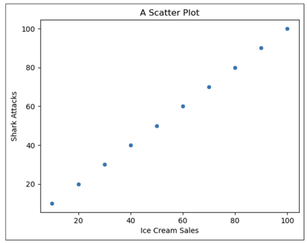
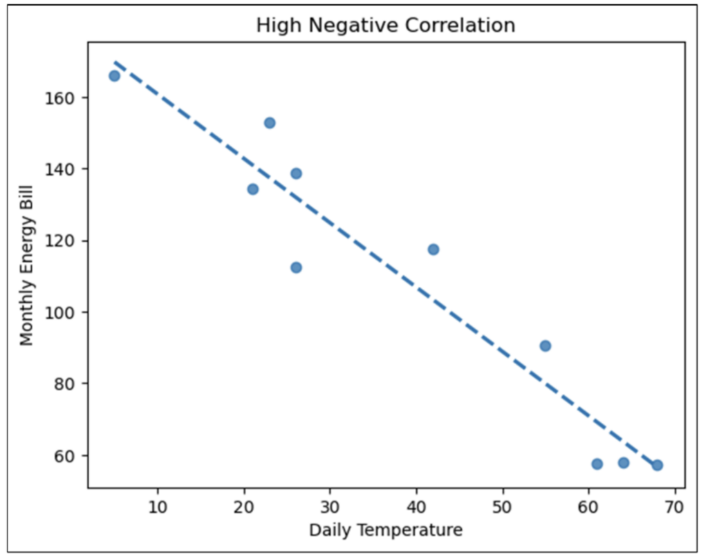
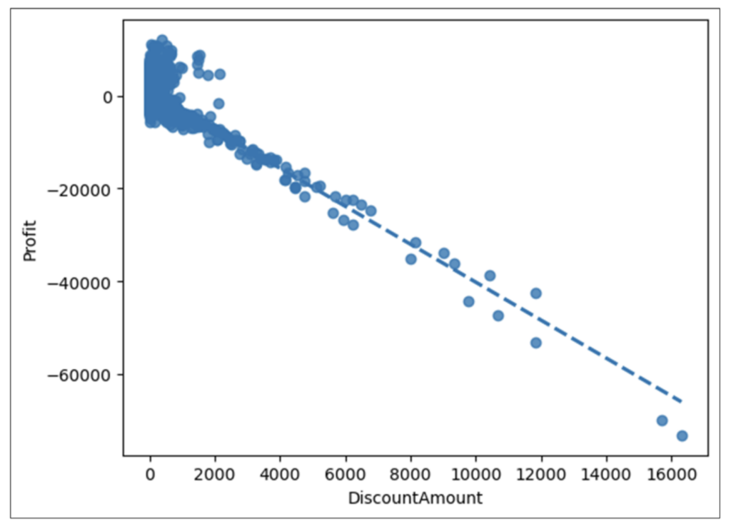
Examining Fig 15 reveals the following:

  • Overall, there is a strong negative correlation between DiscountAmount and Profit.
  • Based on the cloud of data points in the top left of the visualization, the predictive relationship isn’t very strong for very low DiscountAmount values.
  • However, all orders appear to have negative Profit amounts when DiscountAmount exceeds approximately $2,500.

As discussed earlier, this correlation analysis shouldn’t assume that DiscountAmounts cause Profit. However, this highly predictive relationship is certainly worthy of further analysis.

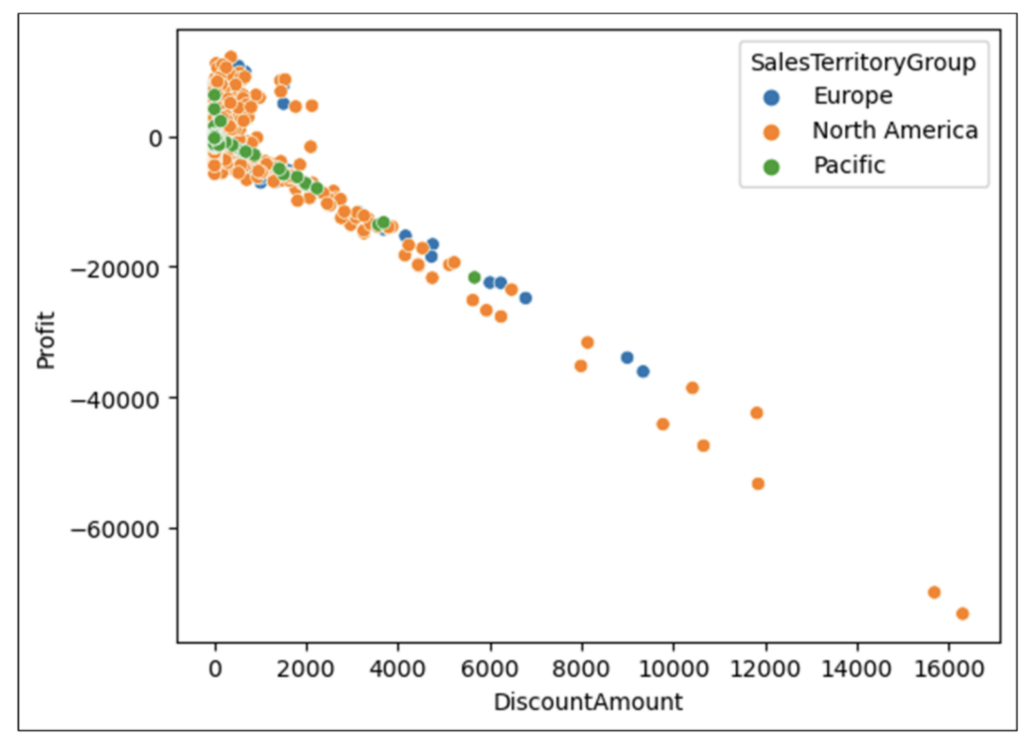
Correlation of Profit by DiscountAmount and SalesTerritoryGroup

An example of drilling more into the correlation of Profit by DiscountAmount is investigating if certain geographies may exhibit higher/lower propensity for profitable/unprofitable orders.

The reseller_orders DataFrame has a SalesTerritoryGroup column containing the following categorical values:

  • Europe
  • North America
  • Pacific

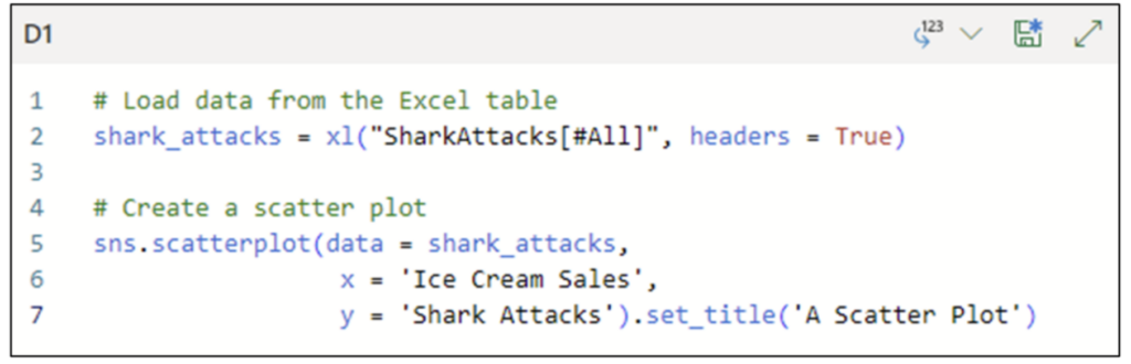
The following code creates a scatter plot of Profit by DiscountAmount and SalesTerritoryGroup:

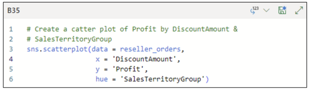
Fig 16 – Python Code for a Scatter Plot with Categorical Data

The code in Fig 16 uses the hue parameter to color code the scatter plot data points based on the values of SalesTerritoryGroup.

The Python Code Editor cell shown in Fig 16 is configured with the Convert to Excel values option. Executing the code produces the following visualization:

Fig 17 – Scatter Plot of Profit by DiscountAmount and SalesTerritoryGroup

Examining the Fig 17 scatter plot reveals the following:

  • There are far more orders placed in North America than in the other geographies.
  • Of the least profitable orders, the bulk are placed in North America.

The combination of Fig 15 and Fig 17 generates questions requiring additional analyses. Two examples:

  • Are there other factors beyond DiscountAmount (e.g., getting rid of excess inventory) that impact Profit?
  • Are there real differences between the geographies that impact Profit? For example, are US sales far less profitable in North America than Canadian sales?

What’s Next?

This post has demonstrated how correlation analysis using scatter plots is a powerful tool for crafting insights between columns of numbers.

Not surprisingly, correlation analysis is a go-to tool in a data analyst’s toolbox.

The next post in this series will switch gears and cover how to perform visual analysis of one of the most common types of data in business analytics – categories like product lines and geographies.

Until next time, stay healthy and happy data sleuthing!

Talk to an Expert

Talk to one of our financial services and banking industry experts to find solutions for your AI journey.

Talk to an Expert