This is the fourth in a series of blog posts that teach you to analyze data using Python code in Microsoft Excel visually.
If you are new to Python in Excel, you should start with my Python for Excel Analysts blog series, which covers many concepts that will be assumed in this blog series.
This series will use the Microsoft Excel Labs Python Editor to write code. However, the Python Editor is not required. All code can be entered using the Formula Bar and the new PY() function.
Each post in the series has an accompanying Microsoft Excel workbook to download and use to build your skills. This post’s workbook is available for download here.
For convenience, here are links to all the blog posts in this series:
This blog post will continue the hypothetical scenario started in Part 3 – analyzing the impact of promotion strategies.
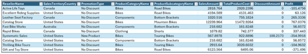
The following table of reseller sales data is included in the workbook for this blog post:
Fig 01 – Reseller Sales Data
The table in Fig 01 illustrates a very common scenario in business analytics – the extensive use of categorical data like geographies and products.
The go-to visualization for analyzing categorical data is bar charts. You may know these visualizations as column charts in Microsoft Excel.
Introducing Bar Charts
The Python seaborn library makes creating bar charts quite easy. Only a few lines of code are required.
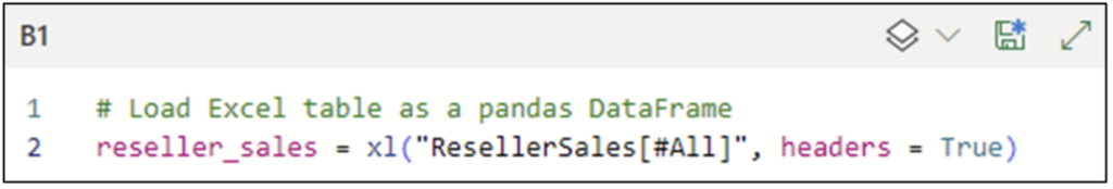
To craft seaborn bar charts needed to analyze data, the Excel table shown in Fig 01 must be loaded as a pandas DataFrame:
Fig 02 – Python Code for Loading Data
Note: While the above Python code is written using the Excel Labs Python Editor, this is not required.
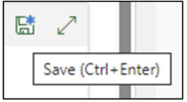
Clicking the disk icon tells the Python Code Editor to execute the Python code:
Fig 03 – Executing the Python Code
Your First Bar Chart
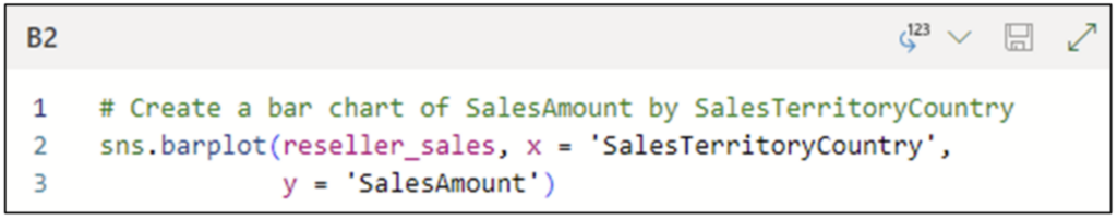
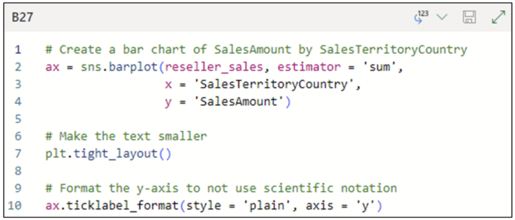
A logical place to start the analysis is to understand SalesAmounts by SalesTerritoryCountry. The following Python code uses the seaborn barplot() function to create a bar chart:
Fig 04 – Python Code for a Bar Chart
The code shown in Fig 04 configures the bar chart as follows:
The reseller_sales DataFrame is the data source of the visualization.
The SalesTerritoryCountry column is mapped to the x-axis.
The SalesAmount column is mapped to the y-axis.
Configuring the code cell with the Convert to Excel values option will render the bar chart directly in the worksheet cell:
Fig 05 – Rendering the Bar Chart Inside the Worksheet Cell
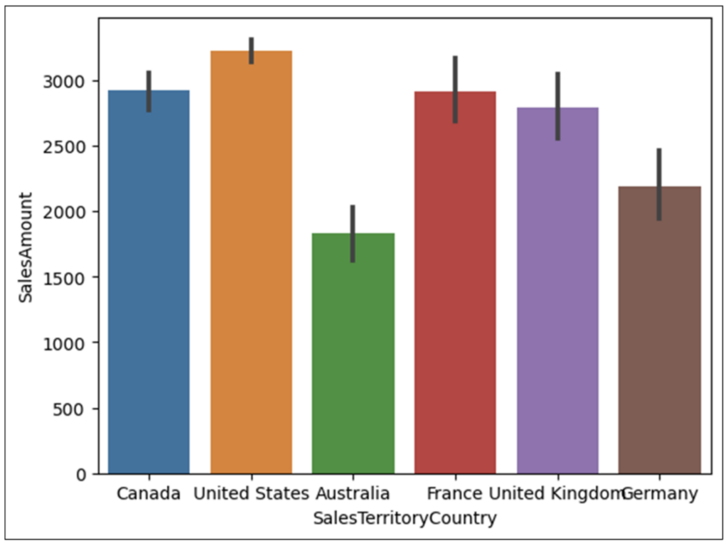
Clicking the disk icon in the Python Code Editor executes the code and produces the following bar chart:
Fig 06 – Your First Bar Chart
Some things to note about the bar chart depicted in Fig 06:
The barplot() function calculates the average (or mean) of the numeric values by default.
The black vertical line at the top of each bar represents the confidence interval for the average value. Think of this as the range of possible average values.
The country names are hard to read.
Most of the time, the default barplot() behavior of calculating the mean is not what you want.
Fixing the Bar Chart
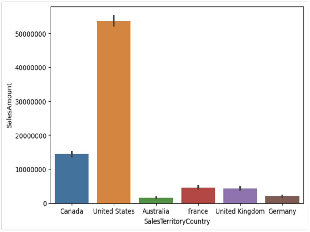
The following Python code addresses the problems in the above bar chart:
Fig 07 – Updated Python Code
Compared to the code in Fig 04, the code in Fig 07 has the following updates:
The estimator is changed to use the sum of the SalesAmount column rather than the mean.
By default, the barplot() function will use scientific notation for large numbers. Using the ticklabel_format() function forces the use of plain numbers.
Executing the code cell with the Convert to Excel values option updates the bar chart:
Fig 08 – The Updated Bar Chart
Examining the bar chart in Fig 08 reveals that the bulk of sales come from Canada and the US.
Categorical Bar Charts
The seaborn barplot() function is designed for scenarios where you are creating bar charts with a numeric column (e.g., SalesAmount) by a categorical column (e.g., SalesTerritoryCountry).
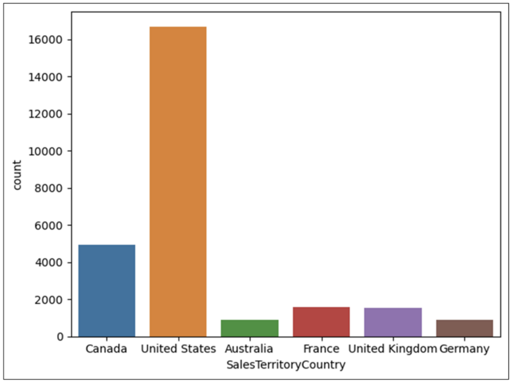
When you want to count categorical values, the seaborn countplot() function is what you use. The following code creates a bar chart counting the various SalesTerritoryCountry values:
Fig 09 – Python Code for a Category-Only Bar Chart
Executing the code cell above with the Convert to Excel values option produces the following:
Fig 10 – Bar Chart of SalesTerritoryCountry Values
Examining the chart in Fig 10 brings no surprises – the highest counts come from Canada and the US.
Promotion Analysis
A common strategy in business analytics is to transform numeric columns into categorical representations.
For example, the following Python code creates a Profitable column on the reseller_sales DataFrame.
Fig 11 – Python Code to Create a Profitable Categorical Column
Note: The above code cell is configured with the Python object output option.
Executing the code cell in Fig 11 creates a boolean (i.e., True/False) column of values which can be used to simplify analyzing promotions.
Profitability by Promotion Type
With the Profitable column created, the following code creates a bar chart of the counts of profitability rows by PromotionType:
Fig 12 – Python Code for Profitable by PromotionType Bar Chart
The code in Fig 12 configures the bar chart as follows:
The reseller_sales DataFrame is the data source of the visualization.
The PromotionType column is mapped to the y-axis.
The Profitable column is mapped to hue.
The last bullet above deserves some additional explanation. The hue parameter allows for adding a second categorical column to the visualization.
In the case of the code in Fig 12, using Profitable for the hue will associate a True and False bar with each unique value of PromotionType. The lengths of these True/False bars will be the counts of the values by PromotionType.
This is a bit abstract, so executing the code cell in Fig 12 produces a visualization which is quite intuitive:
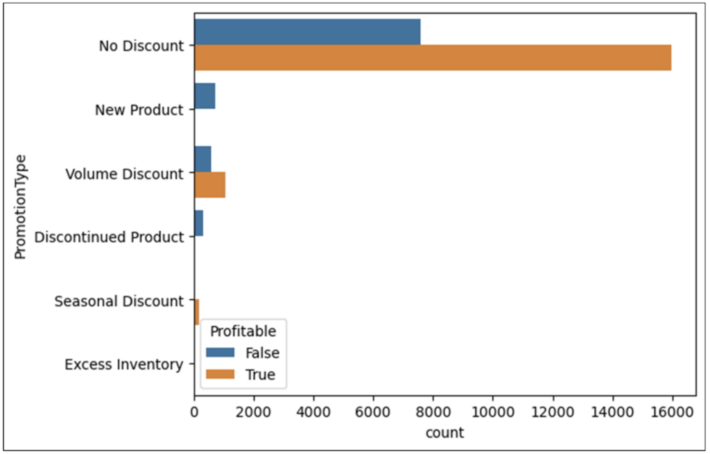
Fig 13 – Bar Chart of Profitable by PromotionType
Examining the bar chart in Fig 13 shows the following:
In terms of volume, sales with No Discount dominate. However, almost 50% of these sales are not profitable.
New Product and Discontinued Product sales appear to always be unprofitable.
Volume Discount sales are often unprofitable.
Seasonal Discount sales appear to be always profitable.
Excess Inventory sales volume is so small as to not be rendered in the visualization.
Fig 13 provides much information into the behavior of promotion profitability and demonstrates a common practice in visual data analysis – visualizing multiple columns simultaneously.
Faceted Bar Charts
As demonstrated by Fig 13, the power of data visualizations increases as the number of columns used in the visualization increases.
The seaborn library supports creating visualizations using many columns simultaneously via a technique known as faceting. Think of a facet as a mini visualization created for the intersection of multiple distinct categorical values.
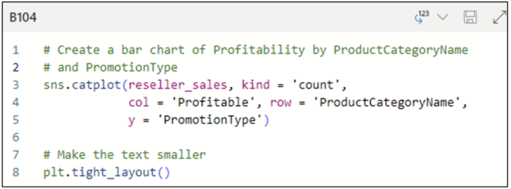
For example, the following code creates a faceted bar chart of Profitability by the combination of ProductCategoryName and PromotionType:
Fig 14 – Python Code for a Faceted Bar Chart
The code in Fig 14 uses the seaborn catplot() function to create a faceted bar chart. The code configures the bar chart as follows:
The reseller_sales DataFrame is the data source of the visualization.
The kind is set to be a count plot (i.e., a bar chart of only categorical data).
The visualization will be created using a grid where there will be a column in the grid for each unique value of Profitable.
Each row of the grid will correspond to a unique value of ProductCategoryName.
Each cell in the grid will be a horizontal bar chart of the values of PromotionType via the y parameter.
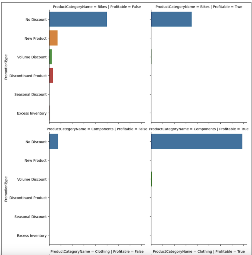
Executing the code cell in Fig 14 generates the following visualization:
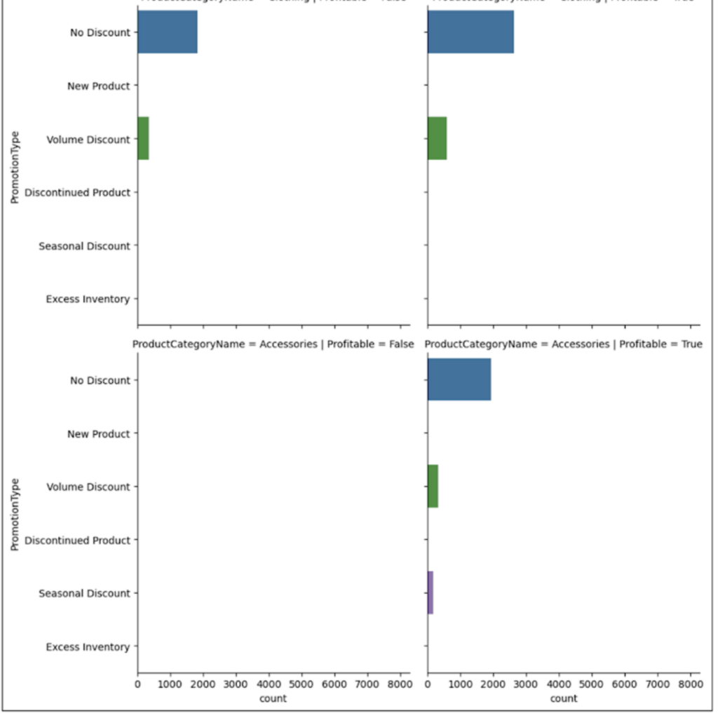
Fig 15 – Faceted Bar Charts
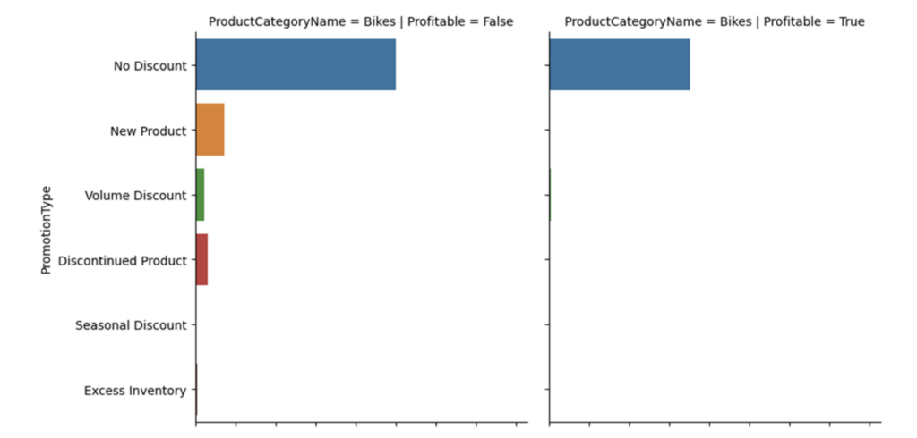
The visualization depicted in Fig 15 is quite large. Here’s just the first row of the visualization to better illustrate how faceting works:
Fig 16 – The First Row of the Faceted Bar Chart
Here’s how to read Fig 16:
The bar chart on the left shows the counts of various values of PromotionType for the Bikes product category where the sales were not Profitable.
The bar chart on the right shows the counts of various values of PromotionType for the Bikes product category where the sales were Profitable.
Fig 16 shows that the Bikes category is not profitable as measured by sales counts. This is only one perspective into the data and might not tell the most accurate story.
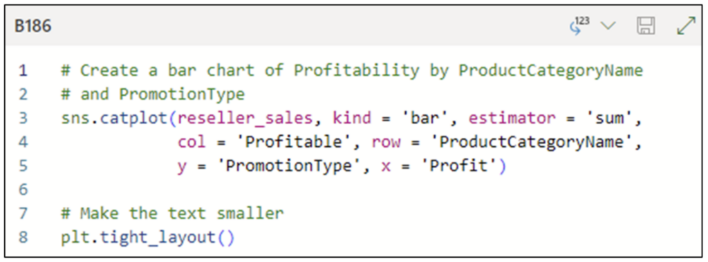
The following code creates a faceted bar chart that uses the summation of Profit instead to get a different perspective into the data:
Fig 17 – Python Code for Updated Faceted Bar Chart
Compared to the code in Fig 14, that in Fig 17 has the following updates:
The kind is changed to be a bar chart (i.e., a numeric column by a categorical column).
The estimator is set to be the summation of the numeric column.
The numeric column is set via the x parameter to be the Profit column.
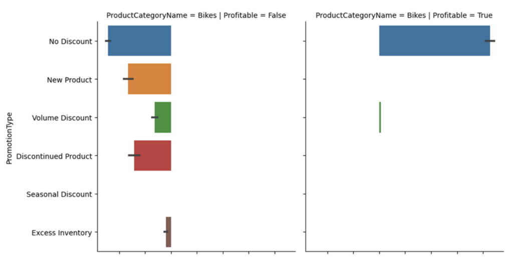
The following is the first row of the updated faceted bar chart:
Fig 18 – The First Row of the Updated Faceted Bar Chart
Examining the facets in Fig 18 conveys a more detailed story. When the losses for the Bike category across all PromotionType values are considered, the Bikes category overall is unprofitable!
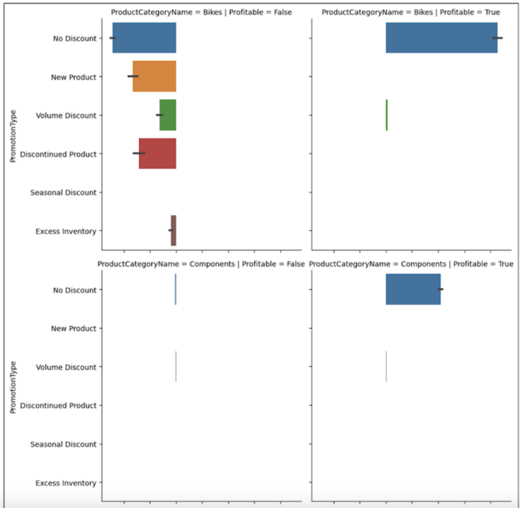
Here is the entire updated faceted bar chart.
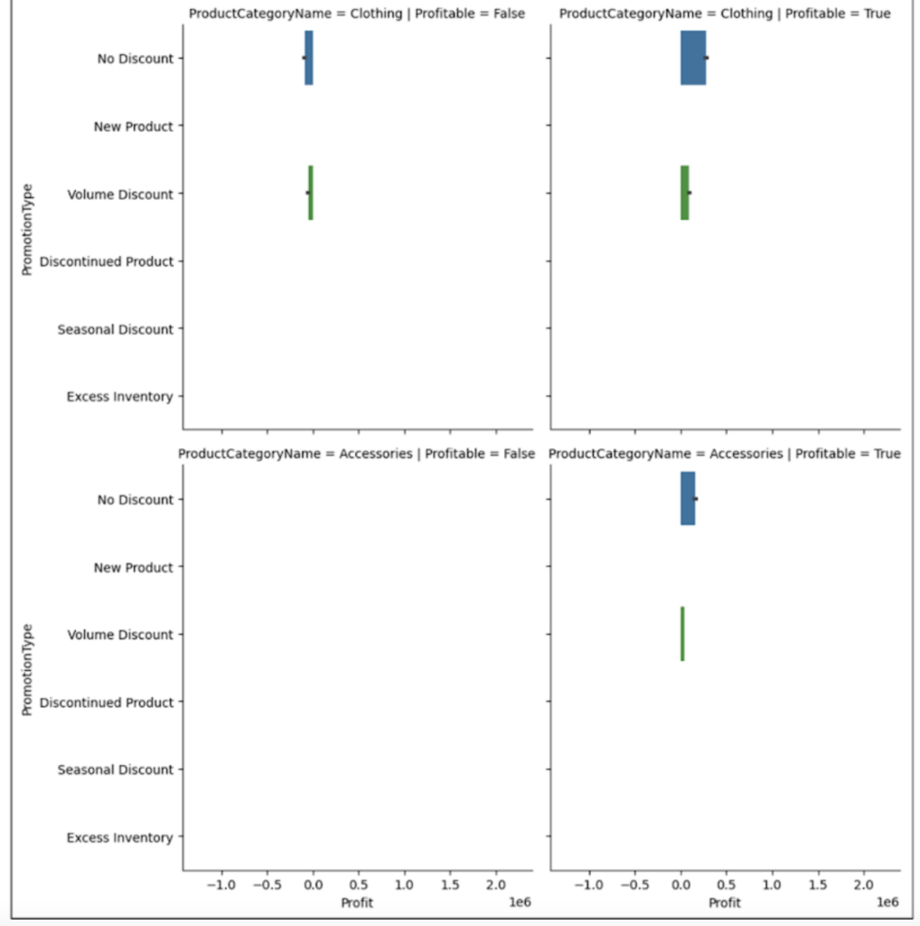
Fig 19 – The Entire Updated Faceted Bar Chart
Examining the faceted bar chart in Fig 19 tells a powerful story:
The Bikes category is by far the largest in terms of profit/loss. Unfortunately, overall, the Bikes category is unprofitable.
Loses are present in the Components and Clothing categories. Fortunately, overall, these categories are profitable.
The Accessories category appears to only have profitable sales.
Using the techniques covered in this blog post, you now have the skills to dig further into the data to uncover more of the “why” of what’s happening with promotions.
For example, digging into further details regarding the Bikes category to uncover potential drivers and patterns of unprofitable sales.
What’s Next?
This post has demonstrated how bar charts should be one of your go-to data analysis tools. Not surprisingly, bar charts are one of the most used data visualizations (e.g., executive dashboards).
In particular, faceted bar charts are useful for crafting compelling data stories for decision-makers.
The next and final posts in this series will introduce you to the single best visualization for analyzing business data – the mighty line chart.
Until next time, stay healthy and happy data sleuthing!