Many types of professionals analyze data using different skills. Microsoft Excel users analyze data using Excel PivotTables, while data scientists use statistical and machine learning models.
Despite this diversity, Excel users, data scientists, and statisticians share one universal data analysis skill: visually analyzing data.
This is the first in a five-part blog series introducing you to visually analyzing data with Python in Microsoft Excel.
By the end of the blog series, you will have built fundamental skills in visually analyzing numeric, categorical, and time-series data. These skills are valuable to any professional, regardless of role or industry.
Each post in the series has an accompanying Microsoft Excel workbook to download and use to build your skills. This post’s workbook is available for download here.
For convenience, here are the links to all the blog posts in this series:
There are a few things to note about this blog series:
- First, if you are new to Python in Excel, you should start with my Python for Excel Analysts blog series as it covers many concepts that are assumed in this blog series.
- Second, this series assumes you have enabled the Python in Excel public preview. This Microsoft article provides you with the information needed to get access to Python in Excel.
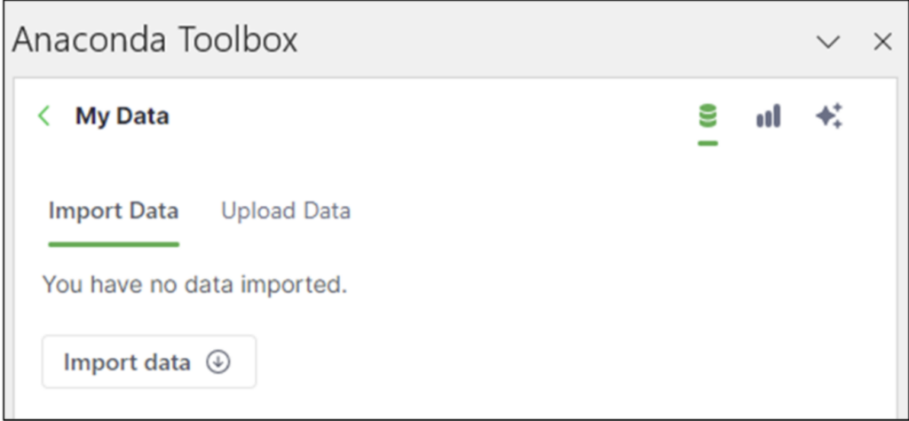
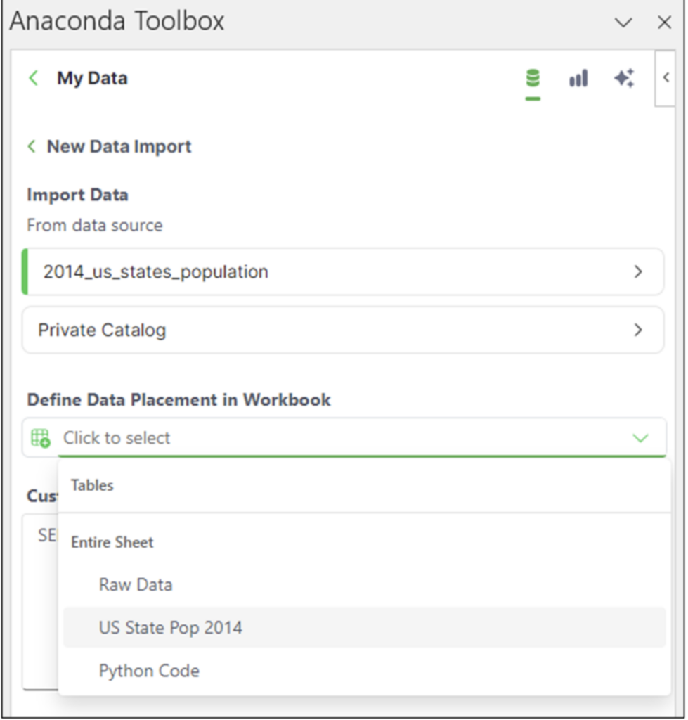
- Lastly, the blog series uses the Anaconda Toolbox for sourcing datasets. However, using the Toolbox is not necessary. All data is included in the Excel workbook downloads.
Summarizing Numeric Data
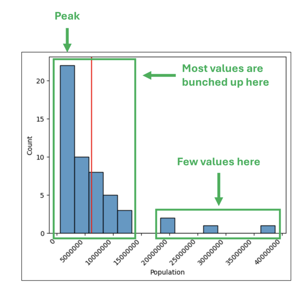
One of the most common data analysis scenarios is crafting insights from a column of numbers. These numbers could be anything – order counts, sales amounts, patient ages, etc.
If the column is small (e.g., 10 individual values), it is relatively easy to look at the raw numbers and craft insights by answering the following questions:
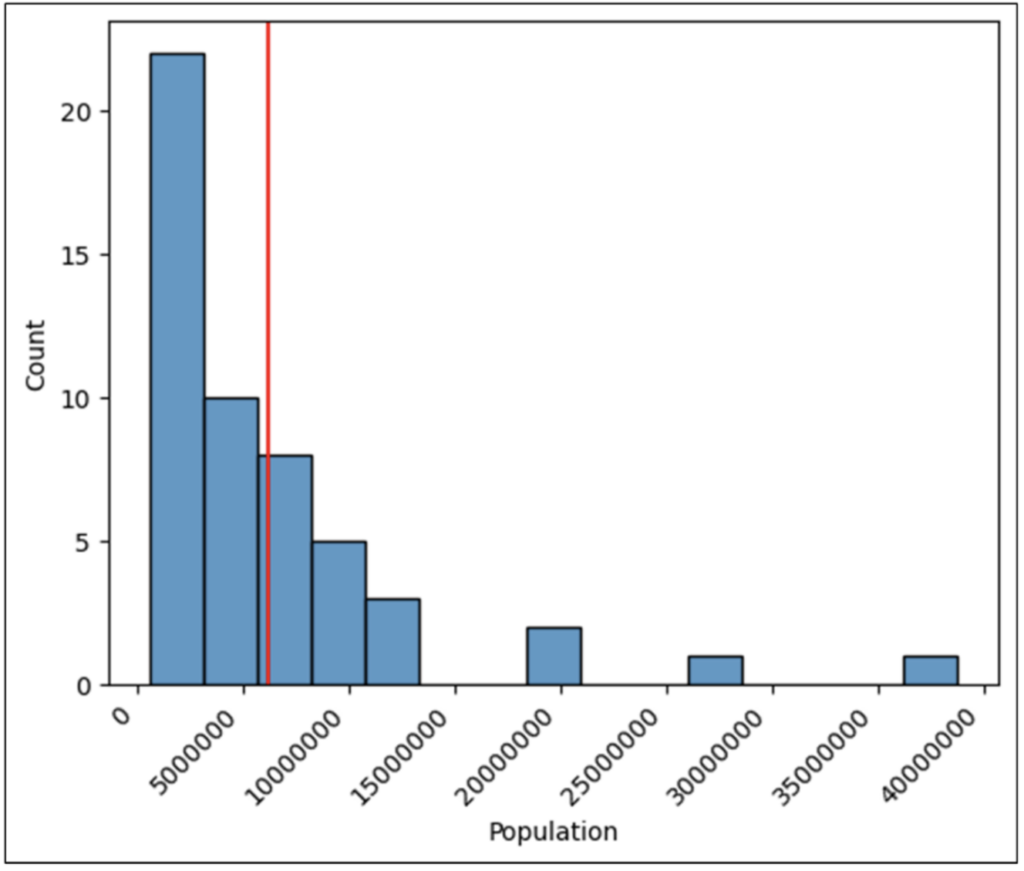
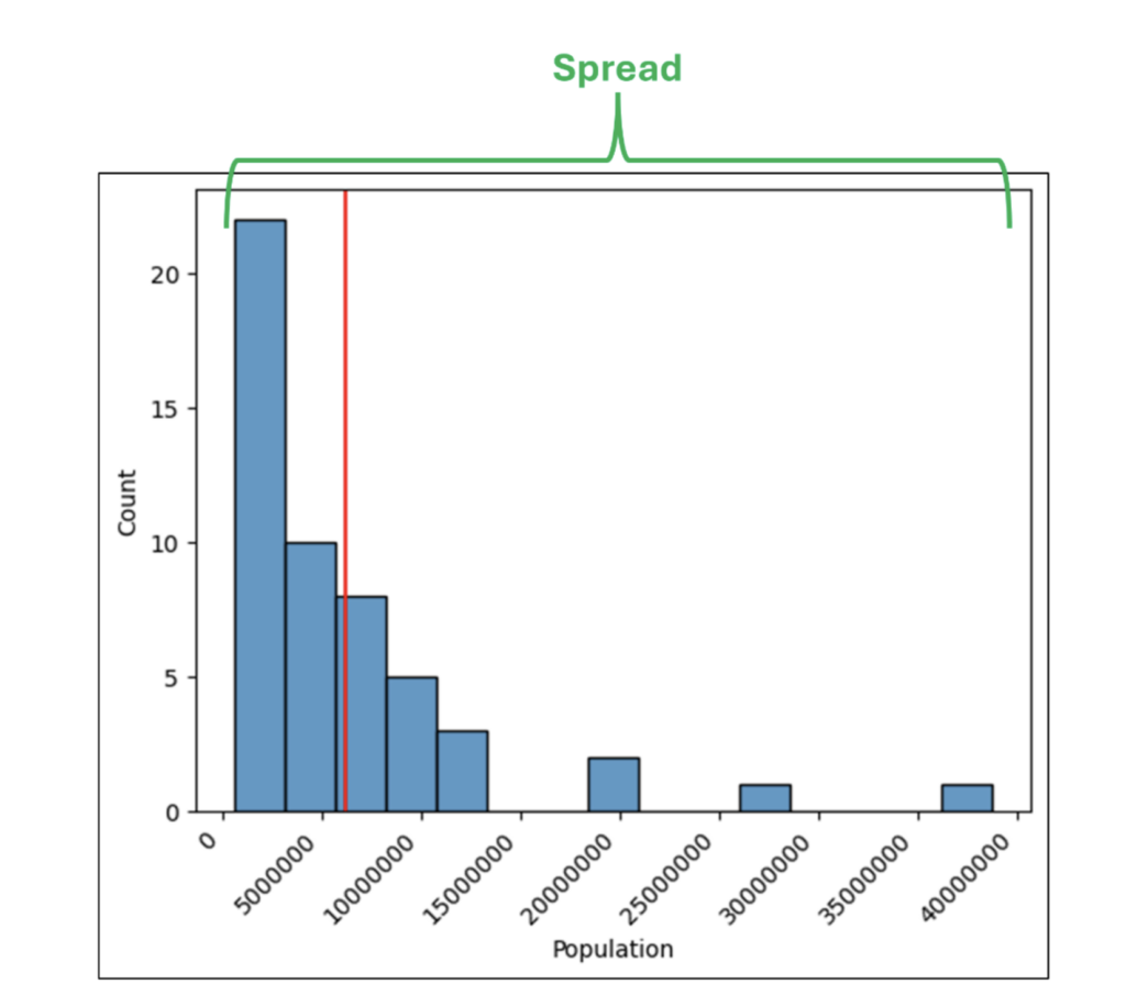
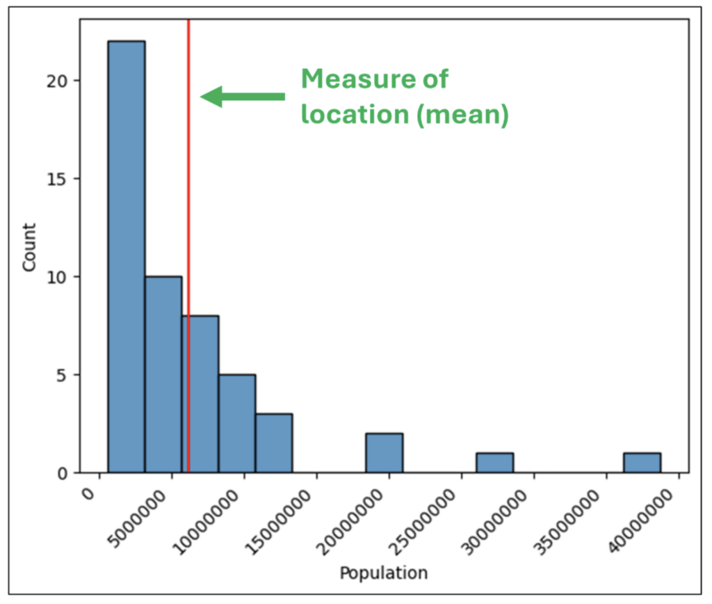
- What are the minimum and maximum values?
- How widely do the values vary?
- What is a typical value for the collection of numbers?
However, a column is rarely so small to allow for this. As humans, our ability to craft insights about a column of numbers drops precipitously with larger columns.
This is where summarizing a column of numbers comes into play. Microsoft Excel functions like MIN(), MAX(), STDEV.S(), and AVERAGE() are commonly used to summarize numeric data and provide insights.
While the above functions (and the Python equivalents) are undoubtedly helpful, they only tell part of the story. This is where visually analyzing columns of numbers enters the picture (pun intended!).
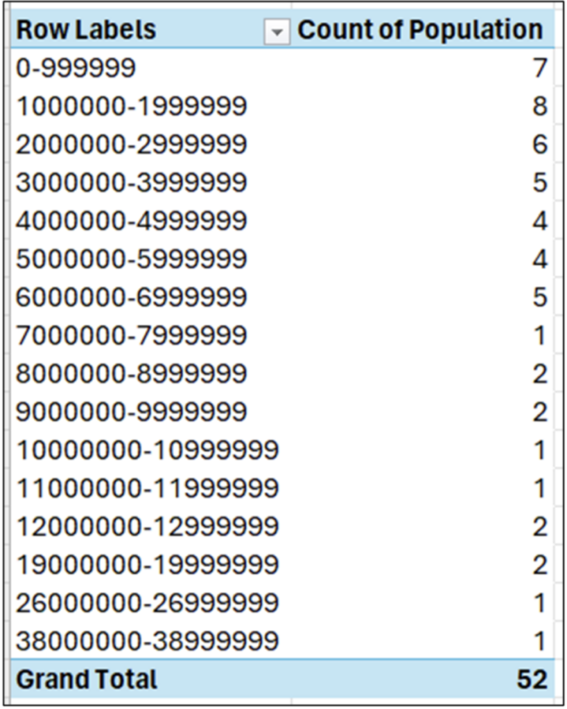
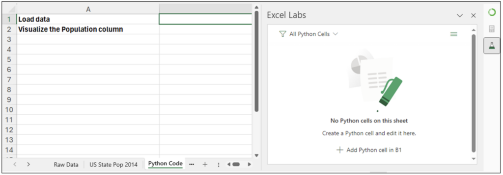
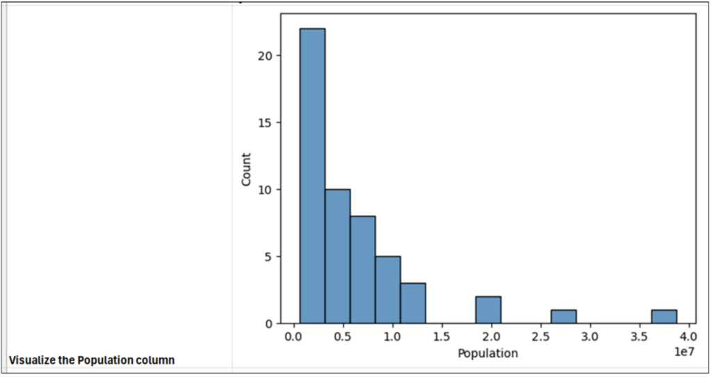
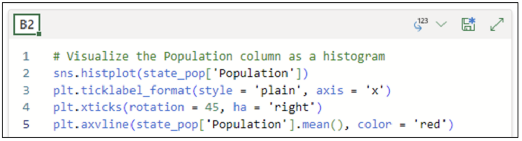
US State Population Data
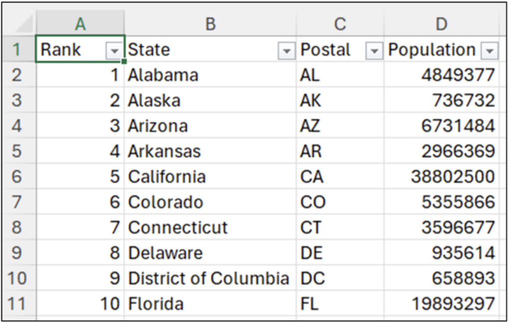
This post will use 2014 population data for the 50 US states, the District of Columbia, and Puerto Rico to introduce you to visually analyzing columns of numbers.
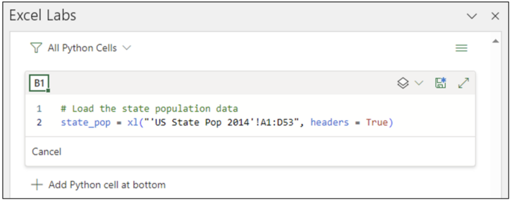
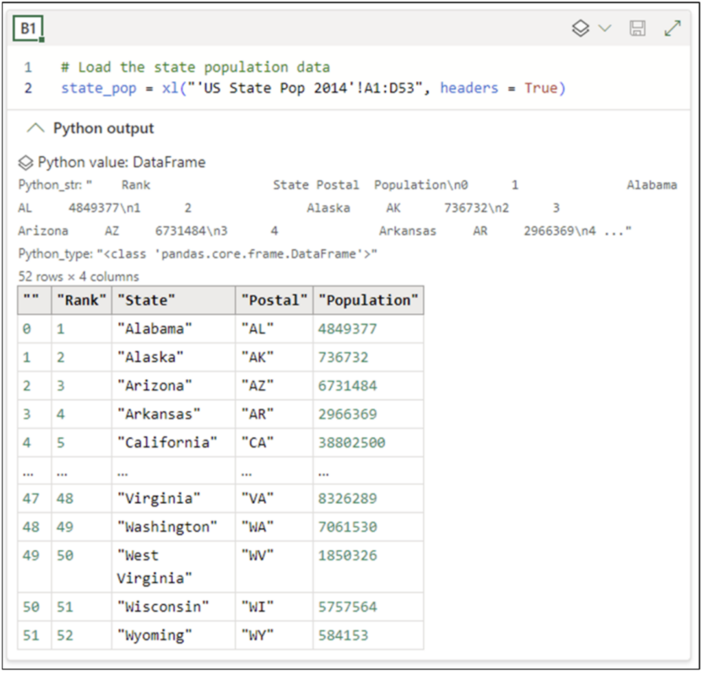
NOTE – The Excel workbook accompanying this blog post has a Raw Data worksheet containing the dataset that can be used instead of importing the data using the Anaconda Toolbox.
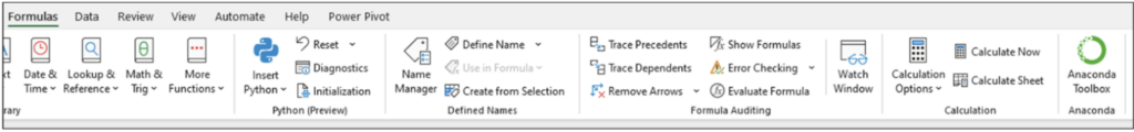
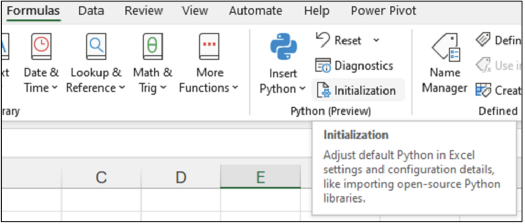
This dataset is easily accessible from the Anaconda Toolbox Add-in. The Toolbox lives in the Excel Ribbon under Formulas: