Visual Data Analysis with Python in Excel: Using Boxplots

Dave Langer

Dark blue background with a green gradient diagonal. In the top right corner 'Python in Excel' and the center has a green frame with the words 'Series: learning universal data analysis skills" inside.

This is the second in a series of blog posts that teach you to analyze data using Python code in Microsoft Excel visually.

If you are new to Python in Excel, you should start with my Python for Excel Analysts blog series, which covers many concepts that will be assumed in this blog series.

This series will use the Microsoft Excel Labs Python Editor to write code. However, the Python Editor is not required. All code can be entered using the Formula Bar and the new PY() function.

Each post in the series has an accompanying Microsoft Excel workbook to download and use to build your skills. This post’s workbook is available for download here.

For convenience, here are the links to all the blog posts in this series:

Note: To reproduce the examples in this post, install the Python in Excel trial. If you like this blog series, check out my self-paced certification program, Anaconda Certified: Data Analysis with Python in Excel.

Understanding Distributions Using Quartiles

As discussed in Part 1 of this blog series, crafting insights from a column of numbers by visually inspecting raw data quickly becomes impossible as the column gets larger. 

Part 1 demonstrated how histograms visually represent how the numbers in a column are distributed. Using histograms enables crafting insights from columns containing 1000s of values. The following is an example histogram, which is discussed in Part 1:

Fig 01 – A Histogram from Part 1 of This Blog Series

As useful as histograms are, they are not the only data visualization that can be used to craft insights from columns of numbers.

Box plots are another means to visualize the distribution of numeric columns. What sets box plots apart from histograms is that they use quartiles to characterize distributions.

The Median

The easiest way to think about quartiles is to consider the median. The median is defined as the value that represents the 50th percentile for a column of numbers. In other words, the median is the 2nd quartile.

Conceptually, the median represents a typical value given a collection of numbers (e.g., a numeric column in a DataFrame).

Consider the following 10 numbers. These numbers are drawn from the ResellerSales table in this blog post’s Excel workbook:

Fig 02 – Ten Numbers Drawn from the ResellerSales Table

Visually inspecting the data, a reasonable guess is that a typical value for these 10 numbers is about $2,000. This guess is confirmed by the average (or mean) of these 10 numbers being $2,047.

Now consider this: What if the last value was replaced and the 10 number are now as follows:

Fig 03 – A New Set of 10 Numbers

Visually inspecting the data shown in Fig 03, the following characterizes the data:

  • Half the values are around $2,000.
  • Two values are below $2,000.
  • Three values are above $2,000.

Arguably, a reasonable guess for a typical value for these 10 numbers is again $2,000.

However, the average of these 10 values is now $2,854 – much closer to $3,000 than $2,000!

We can compare the reasonable guess and the average for a typical value to using the median instead. 

The first step in finding the median is to sort the data in Fig 03:

Fig 04 – Sorted Data

Next, the median is the value in the middle of the sorted data:

Fig 05 – The Median of the Data

As Fig 05 illustrates, there isn’t a single median value when you have an even count of numeric values (i.e., 10 in this example).

In these situations, the median is calculated as the average of the two values in the center of the sorted data. In this example, the two values are the same, so the median is $2,039.994.

This example illustrates a prime example of why the median is useful as a typical value for a column of numbers.

Small/large values less influence the median compared to the average.

From Medians to Quartiles

As mentioned above, the median represents the 50% value of a collection of numeric data, or the 2nd quartile, and represents a typical value for the data collection.

Additional quartiles can also be used to help characterize the spread of the distribution. 

For example, by adding the 1st and 3rd quartiles to Fig 05, we can start to see how the values in the data spread out:

Fig 06 – Adding the 1st and 3rd Quartiles

Note: Fig 06 is a conceptual representation of the 1st and 3rd quartiles. The exact calculations are a bit different.

Granted, Fig 06 doesn’t do a great job of demonstrating the value of using quartiles to characterize the distribution of numeric data. 

The power of using quartiles in this way becomes clear on using box plots to characterize the distribution of many numeric values.

Your First Box Plot

Box plots, like histograms, are a very powerful way to visualize the distribution of a numeric column of data. Box plots utilize quartiles to illustrate the distribution of numeric data. 

What makes box plots particularly powerful is they can visualize distributions by categories.

This blog post will use the data in the ResellerSales table included in this post’s Excel workbook. 

The ResellerSales table contains hypothetical sales data based on Microsoft’s AdventureWorks Data Warehouse sample database.

The data consists of 60,855 rows and 23 columns of data. For this post, the following three columns will be used: SalesTerritoryGroup, SalesAmount, and OrderDate

Coding a Box Plot

In this post, we will analyze the distribution of the SalesAmount column of the ResellerSales tables using box plots.

Box plots are usually built using two columns from an Excel table – one column of numbers and one column of categories.

First, the following Python code loads the ResellerSales Excel table using the pandas library:

Fig 07 – Python Code to Load the ResellerSales Excel Table

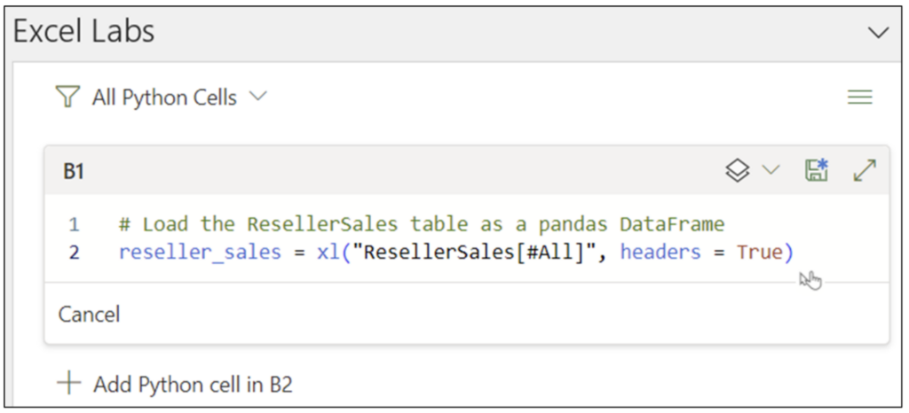
Note: While the above Python code is written using the Excel Labs Python Editor, this is not required.

Clicking the disk icon in the Python Editor executes the Python code:

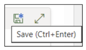
Fig 08 – Python Code Execution

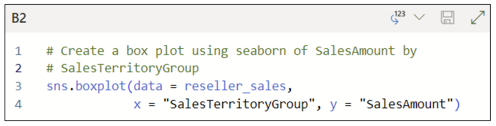
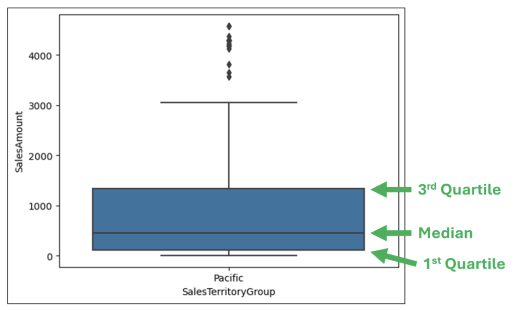
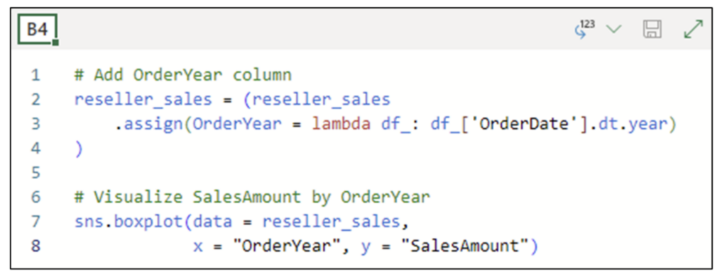
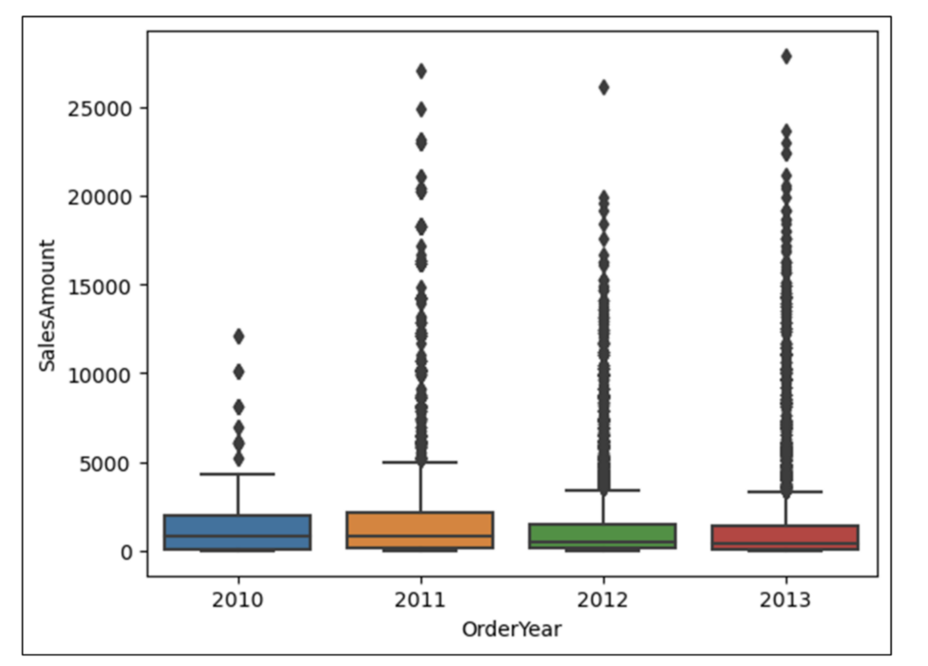
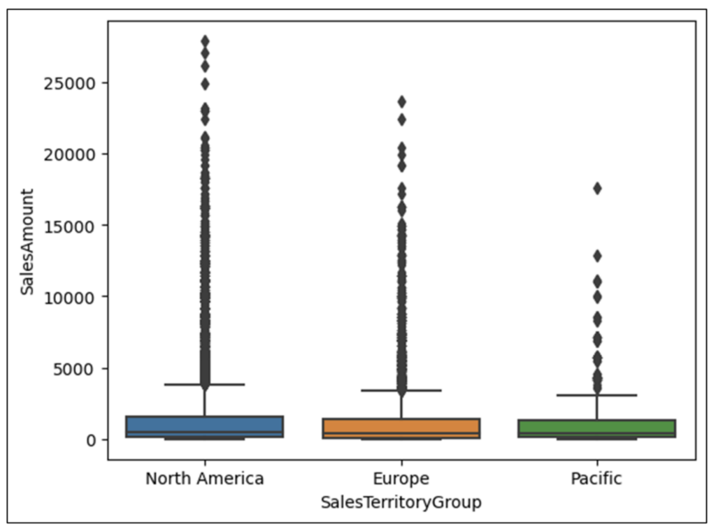
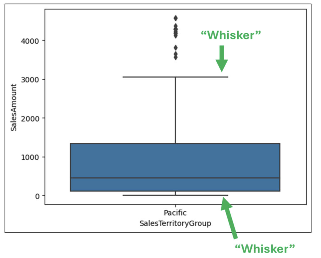
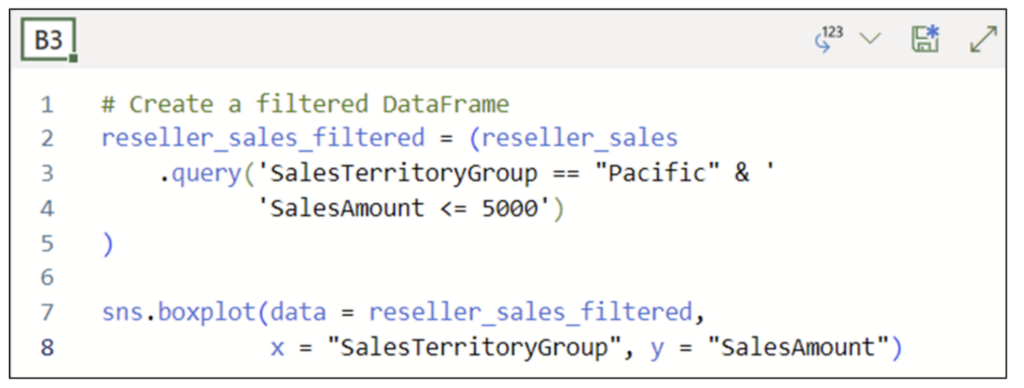
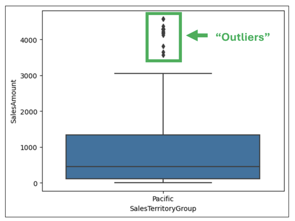
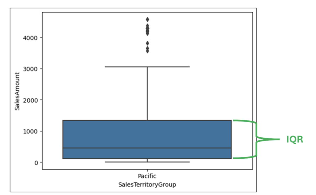
With the data loaded as a DataFrame, the following Python code uses the seaborn library to create a box plot using the SalesAmount and SalesTerritoryGroup columns:

Fig 09 – Python Code for Creating a Box Plot

Clicking on the downward arrow in the Python Editor for the cell allows for selecting the Convert to Excel values option. Using this option renders the box plot inside the worksheet cell:

Fig 10 – Rendering the Box Plot Inside the Worksheet Cell

Executing the box plot code renders the visualization:

Fig 11 – Box Plot of SalesAmount by SalesTerritoryGroup

The box plot provides powerful insights into SalesAmounts. However, to glean these insights, you must know how to interpret box plots.

Interpreting Box Plots

The following Python code filters the reseller_sales DataFrame and visualizes it as a box plot. Filtering makes for a simpler visualization:

Fig 12 – Filtering the reseller_sales DataFrame and Visualizing as a Box Plot

Note: Fig 12 shows the code cell configured with the Convert to Excel values option.

Executing the above code produces the following box plot:

Fig 13 – The Filtered Box Plot of SalesAmount by SalesTerritoryGroup

Fig 13 illustrates how to interpret the box in a box plot:

  • The top of the box represents the 75th percentile of the data (i.e., 75% of values are less than this line).
  • The bottom of the box represents the 25th percentile of the data (i.e., 25% of values are less than this line.
  • The line between the top and bottom of the box is the median of the data (i.e., the 50th percentile).

Examining the box provides many insights regarding the distribution of SalesAmount for the Pacific SalesTerritoryGroup (Fig 13):

  • The top of the box shows that 75% of the SalesAmounts are well below $2,000.
  • The median line shows that 50% of the SalesAmounts are approximately $500 or less.
  • Given that the median line is in the lower 1/3 of the box, the SalesAmounts are skewed to lower values.

From an analysis perspective, the above generates the following questions that will require spelunking into the data:

  • What products are associated with skewing the SalesAmounts to low values?
  • What customers are associated with skewing the SalesAmounts to low values?
  • Are other factors (e.g., discounts) contributing to skewing SalesAmounts to low values?

The next aspect of analyzing numeric data with the box plot is considering the “whiskers”:

Fig 14 – Box Plot “Whiskers”

The whiskers in a box plot visually display the distribution of values that are larger than the 75th percentile and lower than the 25th percentile.

Intuitively, the longer the whisker, the more spread out are the values in the data. Reflexively, the shorter the whisker, the less spread out are the values in the data.

Examining Fig 14 provides the following example insights:

  • The top whisker is far longer than the bottom one, indicating a range of high SalesAmounts from approximately $1,200 to $3,000.
  • The bottom whisker is very short, indicating that most low SalesAmounts range from $0 to approximately $100.

From an analysis perspective, examining these whiskers generates the following additional questions:

  • Were SalesAmounts higher in the past than they are now?
  • Have new lower-cost products been introduced over time, potentially skewing SalesAmounts?
  • Has the use of promotional discounts changed over time?

The last aspect of analyzing numeric data with the box plot is considering “outliers”:

Fig 15 – Box Plot “Outliers

Box plots use a standardized calculation for determining the length of the whiskers (see below for details). Any values outside the whiskers are referred to as “outliers.”

Examining Fig 15 provides insights regarding SalesAmounts outliers:

  • There is many outlying large SalesAmounts
  • There is no outlying small SalesAmounts.

Further analysis into these outliers is warranted to understand patterns in the data associated with these values. For example:

  • Do outlying SalesAmounts originate from a small number of large customers?
  • Have outlying SalesAmounts been consistent over time?

While many of the above analysis questions can also be generated by examining histograms, as we will see later in this blog post, box plots offer more analysis capabilities beyond outliers.

The Math of Outliers

While there are many possibilities for determining the length of the whiskers in a box plot, the following covers the most common calculations used.

The first calculation used in building box plot whiskers is the interquartile range (IQR). In the case of box plots, the IQR is the difference between the 3rd and the 1st quartile (i.e., the height of the box).

Fig 16 – Interquartile Range (IQR)

To calculate the top whisker, the following logic is used:

  • The maximum data value or…
  • The 75th percentile + (1.5 * IQR)…
  • Whichever is smaller.

And to calculate the bottom whisker, the following logic is used:

  • The minimum data value or…
  • The 25th percentile – (1.5 * IQR)…
  • Whichever is larger.

Box Plots Over Time

When analyzing data using box plots, it is common to generate analysis questions that relate to time. For example, has the distribution of SalesAmount values changed over the years?

This is an area where box plots have an advantage over histograms – you can consider time (e.g., years) as a category!

The following code adds an OrderYear column to the reseller_sales DataFrame and then uses the new column to create a box plot of SalesAmounts by OrderYear:

Fig 17 – Visualizing SalesAmounts by OrderYear Using a Box Plot

Note: Fig 17 shows the code cell configured with the Convert to Excel values option.

Executing the code shown in Fig 17 renders the box plot inside the worksheet cell:

Fig 18 – Box Plot of SalesAmounts by OrderYear

Examining the box plot depicted in Fig 18 provides some interesting insights:

  • The heights of the 2012/2013 boxes are shorter than those of the 2010/2011 boxes. This indicates that the distribution of SalesAmounts skewed smaller in later years.
  • The top whiskers for 2012/2013 are shorter than the corresponding 2010/2011 whiskers. This is a further indication that SalesAmounts skewed smaller in later years.
  • There appear to be more outlying large values for SalesAmount in the later years.

The box plot depicted in Fig 18 confirms that additional analysis (e.g., the questions listed above) is required to learn more. 

What’s Next?

This post has demonstrated how you can use box plots to analyze numeric data, including incorporating categories and time into your analyses.

The next post in this series will continue this analysis scenario by exploring the relationships between two columns of numbers using scatter plots.

Until next time, stay healthy and happy data sleuthing!

Talk to an Expert

Talk to one of our financial services and banking industry experts to find solutions for your AI journey.

Talk to an Expert