This could be you! Click here to submit an abstract for our Maker Blog Series.
In this day and age, we use and are exposed to a vast amount of data. Most of this data is connected and features implicit or explicit relationships, and in such cases we can rely on relational databases for organization. But the sheer amount of available data makes generating actionable insights tricky and complex. Generating said insights can be more easily accomplished at industry scale by using self-hosting graph databases like Neo4j in one’s own data center, or by running them on the cloud using providers like Google Cloud’s AuraDB, which natively runs Neo4j. However, this leads to certain challenges including the requirement of computational resources, which tends to become a hurdle for new entrants into the field of graph databases and graph data science.
This blog post seeks to empower developers and data scientists to quickly create graph databases locally on their systems and interact with sample datasets provided by Neo4j and its community. Additionally, this post discusses how to use various open-source Python tools to slice and dice data and apply basic graph data science algorithms for analysis and visualization. We’ll walk through various steps including the collection, manipulation, and storage of an example dataset. I work with a lot of connected data, and in my experience graph databases effectively represent connections and facilitate the use of machine learning and data science algorithms for uncovering underlying patterns.
Preparing the Data
The most important step in using both graph databases and data science tools provided by Anaconda is having the right data. When it comes to big data science problems, in my experience the application of algorithms is a small piece of a larger puzzle; the biggest puzzle pieces are data augmentation and data cleansing.
In the following example, we’ll use the “slack” dataset from the example datasets provided by Neo4j. We’ll query the database using Python APIs in Jupyter Notebook, using Cypher queries to read only the Slack channels and messages from the given dataset.
Pre-Processing the Data
First we’ll complete some minor pre-processing steps for ease of implementation and learning. These steps mainly pertain to the messages contained within the dataset, as they contain the larger portion of text. With regard to the Slack channels in the dataset, we only look for those that are relevant to graphs and related topics.
-
Remove all messages that have a subtype of channel_join, channel_leave, or channel_archive so as to remove noisy messages like “User X joined the channel.”
-
Use the NLTK Python library to tokenize the message text and remove stop words. The NLTK library offers various open-source resources that can be used to tune models and process data.
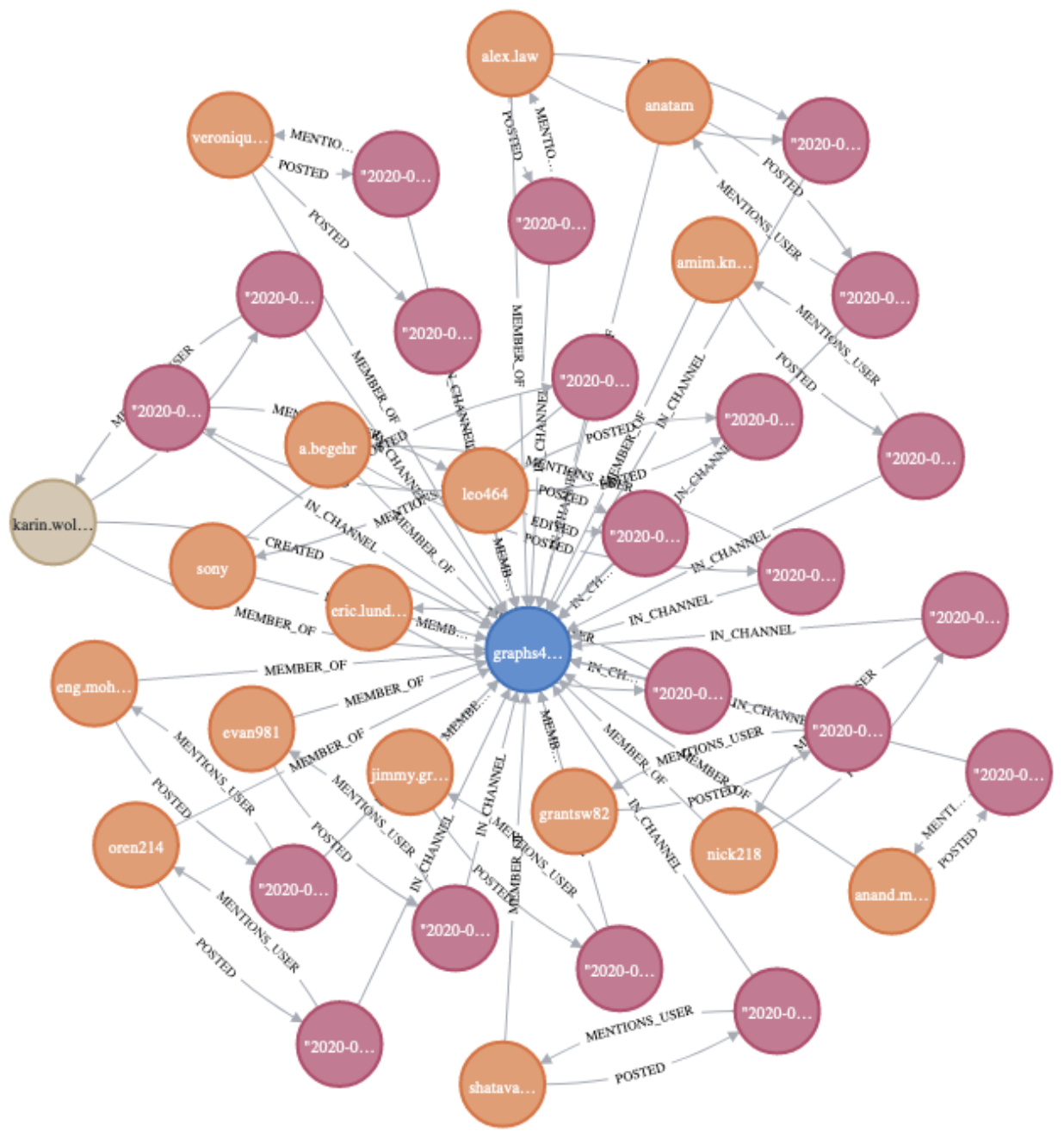
Creating the Graph
Now we can create a graph using nodes based on Slack channel names and text from the Slack messages. The figure below allows us to visualize the relationships indicated in Neo4j Browser; it shows how various messages are connected to a given channel. In terms of relationships, we may want to zero in on the IN_CHANNEL or MENTIONS_CHANNEL labels.
To limit the scope of compute and reduce burden on your local system, the code attempts to limit the number of nodes and relationships present in the graph.
Running Data Science Algorithms
Once the data has been pre-processed and converted to appropriate nodes and relationships, we can use the graphdatascience Python library to create an in-memory graph object with the help of pandas DataFrames—which are widely used for big data management and data science problems. The graphdatascience library makes it possible to run a variety of algorithms; however, we’ll cherry-pick two different kinds of data science algorithms here, for demonstration purposes:
1. PageRank algorithm
We’ll run the famous PageRank algorithm (co-developed by Larry Page and Sergey Brin), which measures the significance of a given node in a graph of nodes that are connected through various relationships. We’ll use the graphdatascience library to run the PageRank algorithm and generate the nodes with the highest scores. The results are plotted using the seaborn library, which is heavily used for statistical data visualization and data representation.
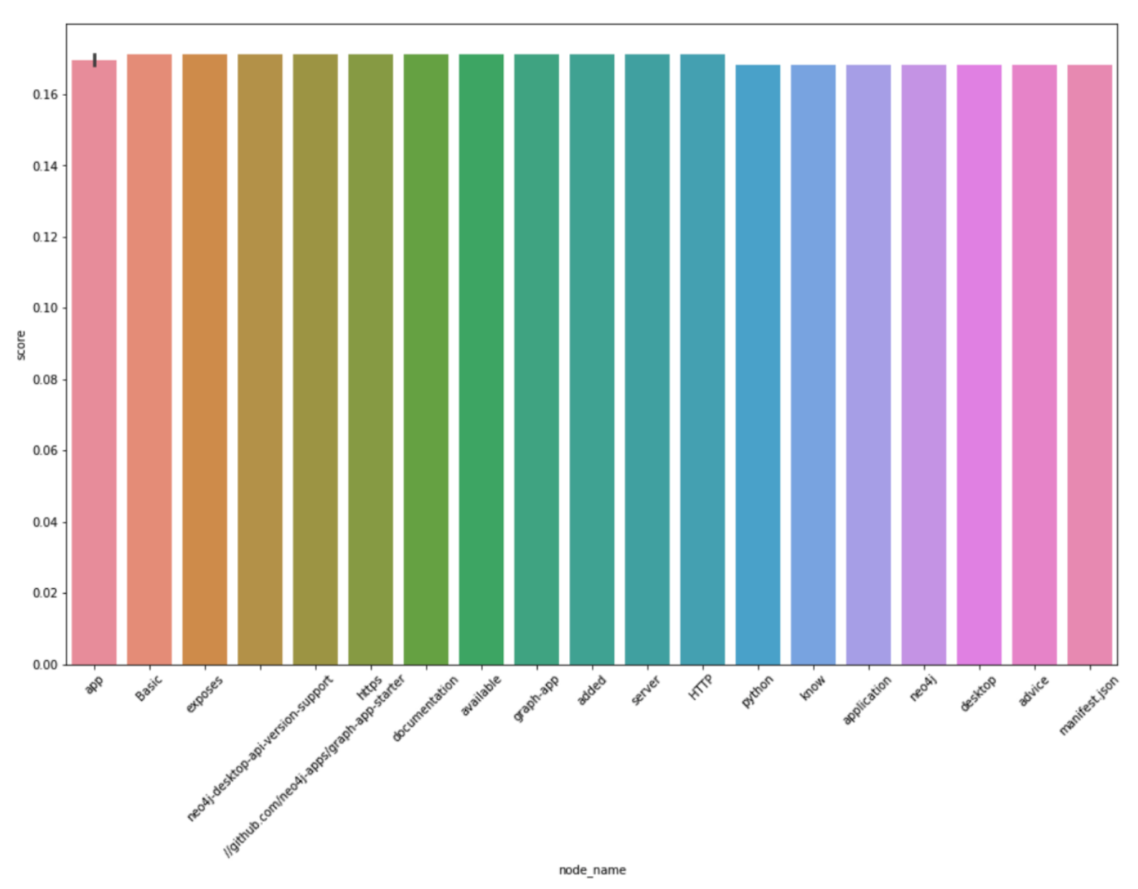
Here, we can see that the data distribution is pretty even. Note that the most important words are those related to graph APIs and the general computing and software industry. Similar analyses can be run on various larger graph datasets locally if system configurations can scale, or in the cloud.
2. Louvain community detection
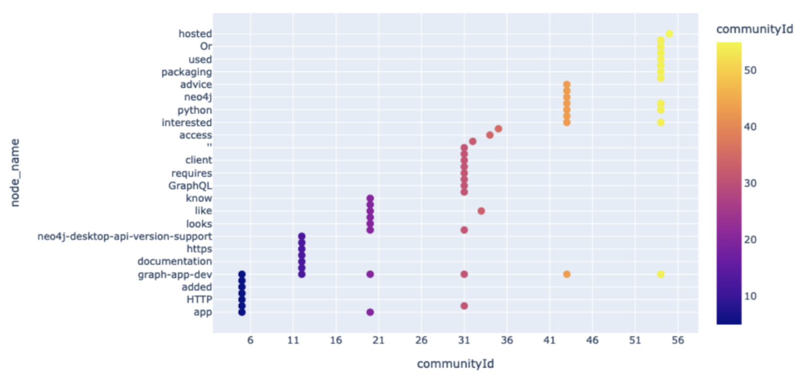
We’ll also run the Louvain community detection algorithm, which uses modularity optimization to identify the density of edges within a community versus outside the community. The Louvain algorithm is a hierarchical clustering algorithm that, when run across multiple iterations, can merge communities into a single node and form condensed graphs.
After running community detection on the small graph, we can observe how the various nodes are distributed across 11 different communities. The distribution can again be visualized using another open-source Python library called Plotly. Plotly is widely used in both the data science industry and in academia for visualizing experiments and results.
Such are the various steps required for quickly prototyping a graph database application, and the right tools for running complex data science algorithms on a graph dataset. Click here to access a Jupyter notebook that explains and performs all of the different steps outlined above.
I hope this Maker blog post helps those who are new to Python, data science, or graph data science learn about the various open-source tools that are available and maintained by a vibrant, active community of developers. Remember that sometimes it’s a good idea to start small and learn tricks for quickly prototyping before jumping into deployments and experimentation with larger systems. Happy prototyping and thanks for reading!
About the Author
Janit Anjaria is a Senior Software Engineer at Aurora Innovation Inc., where he currently works on building high-definition 3-D maps for self-driving vehicles. Before joining Aurora, Janit worked on the Autonomous Vehicle Maps team at Uber Advanced Technology Group. Prior to Uber, he was at the University of Maryland, College Park Spatial Lab working on spatial data structures and machine learning. He has diverse professional and academic experience, and once worked on building out the Location Intelligence Platform at Flipkart Internet Pvt. Ltd. in India. Outside of professional and academic life, he is an open-source enthusiast and has contributed to Apache Solr and LibreOffice and has been a Linux user since 2011.