Data practitioners in enterprise environments regularly face workflows that require extracting, processing, calculating, ingesting, and analyzing data. These activities appear across different shapes and sizes in data science, data engineering, and machine learning (ML) engineering work. This blog illustrates a common real-world example from the insurance industry and provides a step-by-step solution.
In this post, we’ll walk through a complete actuarial analysis pipeline that combines real U.S. Census health insurance data with Snowflake’s cloud data platform, all orchestrated through Anaconda’s Python ecosystem and actuarial modeling with supervised learning.
Anaconda Distribution leverages conda, the open-source package manager and the most widely used environment management tool for anything from light analysis to computationally intensive workflows. With thousands of curated packages in the default distribution, organizations gain access to discipline-specific tools to unlock advanced project analysis with security at the forefront of your experimentation.
In this demo, we’ll look at the challenges of actuarial analysis in an enterprise scenario. We’ll focus on leveraging open data and using open source tools to analyze it within a conda environment. If you’re not familiar with actuarial scenarios, this blog post can help you set up your environment, extract data, create a model for analysis, integrate with Snowflake Snowpark for data management, and derive real-world insights from analysis.
The Challenge: Modern Actuarial Analysis at Scale
Insurance companies today face several data challenges:
- Volume: CPS ASEC Census dataset contains more than 200,000 survey responses (141MB+ files)
- Complexity: Actuarial calculations require modern modeling frameworks
- Performance: Risk modeling needs to scale across millions of policies
- Integration: Data scientists need seamless workflows from exploration to production
This is where the combination of Anaconda and Snowflake creates a modern actuarial stack that scales for real-life use cases.
Our Demo: U.S. Census Health Insurance Analysis
A complex data pipeline like this one may seem familiar to any enterprise organization. In this example, a complete actuarial pipeline:
- Extracts real U.S. Census Current Population Survey (CPS) Annual Social and Economic Supplement (ASEC) health insurance data (2024)
- Processes demographic and coverage information, transform and extracts features for supervised learning
- Calculates life insurance premiums using actuarial models
- Ingests data into Snowflake via Snowpark
- Analyzes portfolio risk and profitability
Let’s dive into the implementation.
Step 1: Setting Up the Modern Actuarial Environment
With open source Python packages optimized and delivered securely for your enterprise environment in the conda ecosystem, Anaconda handles the complex dependency management between data science libraries, cloud connectors, and actuarial packages, while providing modern, transparent actuarial modeling that’s both production-ready and auditable.
# Core data science stack
import pandas as pd
import numpy as np
import matplotlib.pyplot as plt

# Snowflake integration
from snowflake.snowpark import Session
from snowflake.snowpark.types import StructType, StructField, StringType, IntegerType

# Data extraction
import requests
import zipfile
Step 2: Building your Snowflake Resources & Extracting Real Census Data
Rather than using simulated data, we pull actual U.S. Census Bureau health insurance survey data:
Start with creating a warehouse through the Snowflake GUI. You can do this programmatically, but I like to use the GUI so I don’t run into any issues based on what warehouse is defined in my Snowflake worksheet.
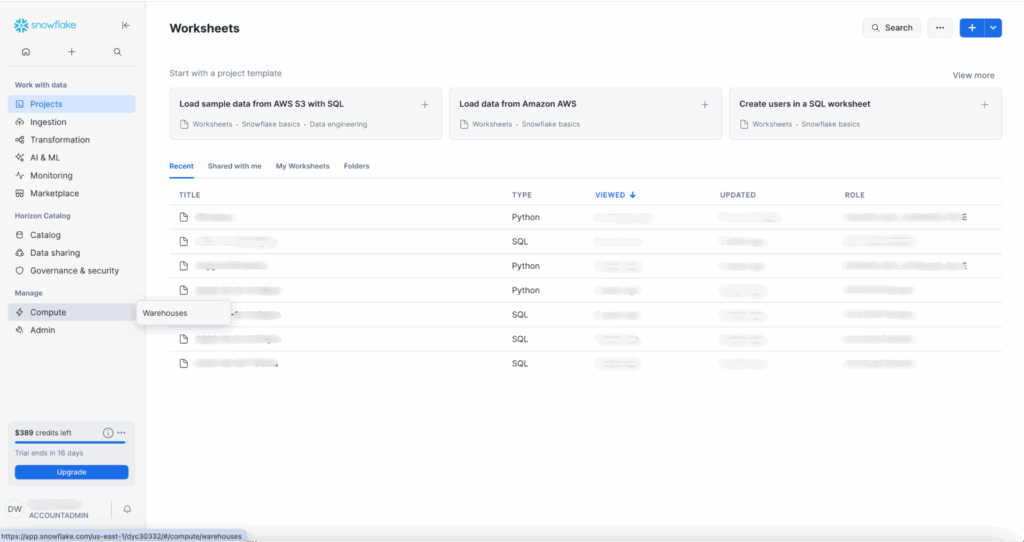
On the left side of your home page, navigate to Manage > Compute > Warehouses.
+ Warehouse in the top-right corner. 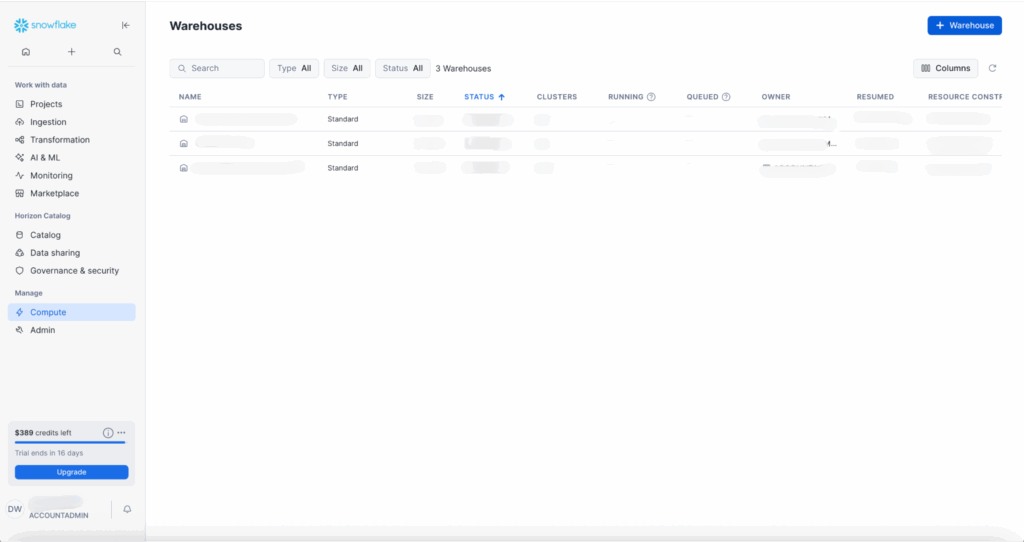
+ button at the top of the left panel to create a Python Worksheet. 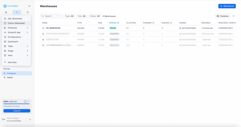
Worksheets are Snowflake’s new interactive development environment (IDE). This new environment allows for nested folders, split panes, and a functional tabbed layout. There are additional bells and whistles with Snowflake copilot and interactive charts for exploratory data analysis. We won’t be covering those today, but this now allows you to use Snowflake as your first stop in your data and discovery journey rather than starting elsewhere and then importing into your Snowflake workspace.
Once you open your worksheet, select the warehouse you just created: FSI_WAREHOUSE.
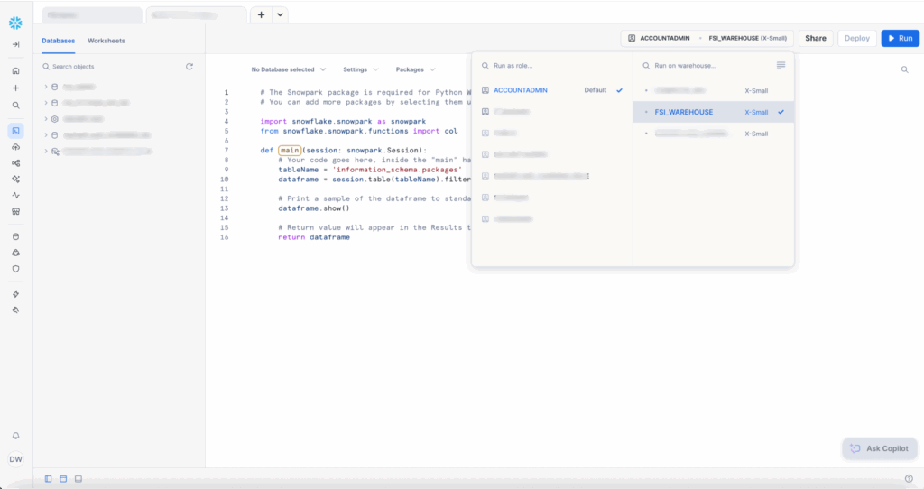
You’re given introductory code to guide you to writing your first method. This tool is built for scripting. You do not have to call your main function. In the settings dropdown, Snowflake defaults to using main() as the entry point to your application.
Want to take a sneak peek of what our Python file will look like? Jump ahead here.
Add snowflake to the installed packages.
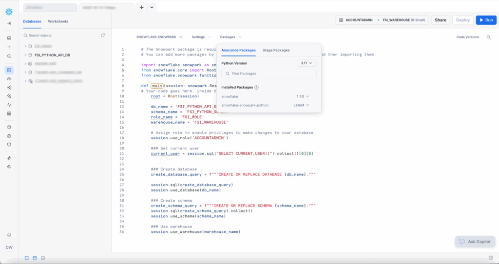
And change the Settings > Return Type to “Variant” since we’re returning None and not a dataframe. Delete everything inside the main() function and paste the code below:
def main(session: snowpark.Session):
    # Your code goes here, inside the "main" handler.
    root = Root(session)

    db_name = 'FSI_PYTHON_API_DB'
    schema_name = 'FSI_PYTHON_SCHEMA'
    role_name = 'FSI_ROLE'
    warehouse_name = 'FSI_WAREHOUSE'

    # Assign role to enable privileges to make changes to your database
    session.use_role('ACCOUNTADMIN')

    ### Set current user
    current_user = session.sql("SELECT CURRENT_USER()").collect()[0][0]

    ### Create database
    create_database_query = f"""CREATE OR REPLACE DATABASE {db_name};"""
    session.sql(create_database_query)
    session.use_database(db_name)

    ### Create schema
    create_schema_query = f"""CREATE OR REPLACE SCHEMA {schema_name};"""
    session.sql(create_schema_query).collect()
    session.use_schema(schema_name)

    ### Use warehouse
    session.use_warehouse(warehouse_name)
    return None
When working with Snowflake’s Python API, one of the first tasks you’ll encounter is setting up your database environment programmatically. Snowflake is a SQL based environment, which uses patterns when manually creating databases, schemas, and managing permissions through the web UI or SQL scripts.

You have now used Snowpark Session to create your database and schema. With your permissions in place, you can start building your data environment.
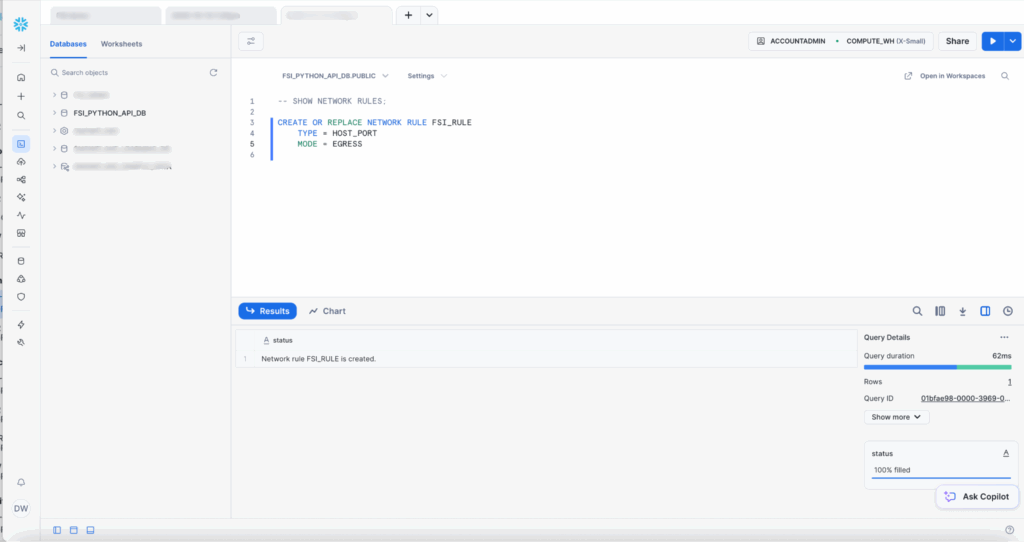
External Network Rules in Snowflake
+ button. 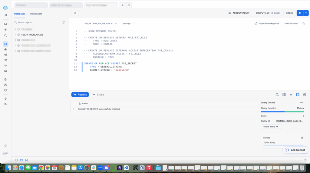
PYPI_RULE out of the box. 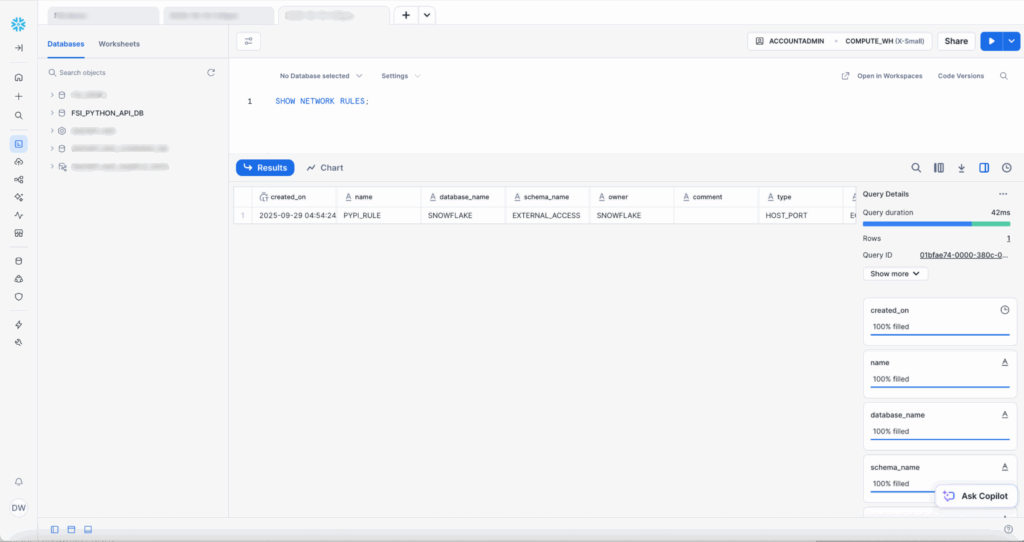
Now, create a new network rule.
Create a secret to hold credentials. I’ve created a basic password with a generic string, but if you have OAUTH with your enterprise environment, opt for the recommended OAUTH password.
Now, create the external access rule. Note: Free trials do not include the ability to set up External Access Rules in Snowflake. This is an enterprise feature.
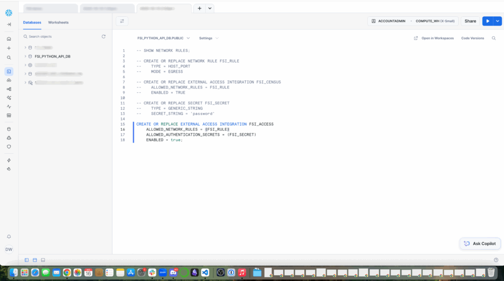
EXTERNAL_ACCESS_INTEGRATIONS parameter to set integration’s name as value, in this example I called mine FSI_ACCESS.
In our integration with Snowpark, we’re using UDFs. This process should be used strategically, because UDFs are statically typed code that can introduce issues if not implemented correctly. For this scenario, we’re using Python UDF to calculate term premiums within Snowflake infrastructure. It can help us with complex data processing with complex business logic.
Your UDF will look something like this:
CREATE OR REPLACE FUNCTION fsi_access_python(sentence STRING, language STRING)
RETURNS STRING
LANGUAGE PYTHON
RUNTIME_VERSION = 3.12
HANDLER = 'get_translation'
EXTERNAL_ACCESS_INTEGRATIONS = (google_apis_access_integration)
PACKAGES = ('snowflake-snowpark-python','requests')
SECRETS = ('cred' = oauth_token )
AS
$$
import _snowflake
import requests
import json
session = requests.Session()
def get_translation(sentence, language):
  url = "https://www2.census.gov/programs-surveys/cps/datasets/2024/march/asecpub24csv.zip"
  data = {'q': sentence,'target': language}
  response = session.post(url, json = data, headers = {"Authorization": "Bearer " + token})
  return response.json()['data']['translations'][0]['translatedText']
$$;
Other ways to ingest data with Snowflake
Snowflake provides secure pathways for other types of data ingestion. The gold standard is pulling data through network calls, connecting a source. Snowflake has native integrations with your cloud storage to remove the overhead of network rules and external access integrations.
Another option is to use Snowpipe, the automated and continuous loading pattern. If the file is a manageable size, you can also try to upload a file via Snowflake’s user interface called SnowSQL. This is as simple as using the interface or using a bash script to PUT and COPY a local file to your Snowflake data store.
Ingesting the data
Your code should now look something like this:
# Add your session parameters
connection_parameters = {
    "account": "<account>",
    "user": "<user>",
    "password": "<password>",
}

# Create your Snowpark connection session
session = Session.builder.configs(connection_parameters).create()

# Your code goes here, inside the "main" handler.
root = Root(session)

db_name = 'FSI_PYTHON_API_DB'
schema_name = 'FSI_PYTHON_SCHEMA'
role_name = 'FSI_ROLE'
warehouse_name = 'FSI_WAREHOUSE'

# Assign role to enable privileges to make changes to your database
session.use_role('ACCOUNTADMIN')

### Set current user
current_user = session.sql("SELECT CURRENT_USER()").collect()[0][0]

### Create database
create_database_query = f"""CREATE OR REPLACE DATABASE {db_name};"""

session.sql(create_database_query)
session.use_database(db_name)

### Create schema
create_schema_query = f"""CREATE OR REPLACE SCHEMA {schema_name};"""
session.sql(create_schema_query).collect()
session.use_schema(schema_name)

### Use warehouse
session.use_warehouse(warehouse_name)

# Download real Census CPS ASEC health insurance data March 2024
fs = fsspec.filesystem("zip", fo="https://www2.census.gov/programs-surveys/cps/datasets/2024/march/asecpub24csv.zip")
filelist = fs.ls("", detail=True)write_pandas(). Without this tool, every row is a separate database operation, and there are network round-trips for every row—no batching or optimization. In this demo, we’re working with tens of thousands of rows, which is at the upper end of what would be manageable without this batch insert tool. But if we were working with hundreds of thousands of rows to millions of rows, common in financial services scenarios, we’d have a wait time worthy of stepping away for coffee or lunch.
Under the hood, write_pandas automatically creates a temporary internal stage and writes the dataframe to an efficient format, uploads those files to stage and then executes a COPY INTO to bulk load the data. This is all done in parallel.
import pandas as pd
from snowflake.connector.pandas_tools import write_pandas

### Setup the Data
## We will use session.sql commands to run basic SQL for setting up our required data

# Key demographic variables for your model:
age_var = 'A_AGE'              # Age
sex_var = 'A_SEX'              # Sex (1=Male, 2=Female)
race_var = 'PRDTRACE'          # Race
hispanic_var = 'PEHSPNON'      # Hispanic origin
marital_var = 'A_MARITL'       # Marital status
education_var = 'A_HGA'        # Educational attainment
employment_var = 'PEMLR'       # Employment status
family_size_var = 'A_FAMNUM'   # Family size
income_var = 'PTOTVAL' or 'PTOT_R'  # Total person income
state_var = 'GESTFIPS'         # State FIPS code

# Health insurance coverage variables (your target variable):
# These are more complex - multiple variables for different types
employer_cov = 'COV_GH'        # Group health (employer)
medicaid_cov = 'COV_MCAID'     # Medicaid
medicare_cov = 'MCARE'         # Medicare
private_cov = 'COV_HI'         # Any private coverage

df_dict = {}
desired_columns = ['PPPOS', 'GEDIV', 'GEREG', 'HEFAMINC', 'HPCTCUT', 'HCOV', 'COV', 'HSUP_WGT', 'A_AGE',
                   'A_SEX', 'PRDTRACE', 'PEHSPNON', 'A_MARITL', 'A_HGA', 'PEMLR', 'A_FAMNUM', 'PTOTVAL',
                  'COV_GH', 'COV_MCAID', 'MCARE', 'COV_HI', 'GESTFIPS']
counter = 0

for csv_file in filelist:
    with fs.open(csv_file['filename']) as f:
        # Read in chunks to avoid memory issues
        df = pd.read_csv(f, low_memory=True) # Enable low_memory
        columns_to_keep = []
        try:
            print("📥 Downloading Census data...")
            columns_to_keep.extend([col for col in desired_columns if col in df.columns])
            df_dict[f'df{counter}'] = { 'name': f'df{counter}', 'data': df[columns_to_keep], 'columns': columns_to_keep }
        except Exception as e:
            print(e)
        counter += 1

table_columns = []

for df in df_dict:
    table_name = df_dict[df]['name']

    session.sql(f"CREATE OR REPLACE TABLE {table_name};")

    if len(table_columns) != 0:
        df_schema = "[" + ", ".join(col for col in df_dict[df]['data'].columns) + "]"
session.write_pandas(df_dict[df]['data'], f'{table_name}_new', database=db_name, schema=schema_name, auto_create_table=True, quote_identifiers=True, overwrite=True)column_name) from the columns defined in the desired_column list:
- Unique id (PPPOS)
- Real geographic distribution (GEDIV, GEREG)
- Actual income patterns (HEFAMINC, HPCTCUT)
- True coverage rates (HCOV, COV)
- Survey weights for population estimation (HSUP_WGT)
Step 3: Exploratory Data Analysis with Notebooks
Skipping exploratory data analysis (EDA) on real-world datasets is like building a house without checking the foundation. Let’s walk through high-level operations and visualizations we can perform in Jupyter notebooks that can easily spot data quality issues, discover risk segments, validate assumptions, and find anomalies.
We’re writing our dataframe to a Snowflake analysis table:
import pandas as pd
import numpy as np
import matplotlib.pyplot as plt

# Health Insurance Coverage Classification Model
# Using CPS ASEC Data to Predict Coverage Type

# The dataframe we will use for this analysis will be the 4th one in the dictionary df3.
df = pd.DataFrame({
    'age': df_dict['df3']['data']['A_AGE'],
    'income': df_dict['df3']['data']['PTOTVAL'],
    'family_size': df_dict['df3']['data']['A_FAMNUM'],
    'employed': df_dict['df3']['data']['PEMLR'],
    'education': df_dict['df3']['data']['A_HGA'],
    'marital_status': df_dict['df3']['data']['A_MARITL'],
    'race': df_dict['df3']['data']['PRDTRACE'],
    'hicoverage': df_dict['df3']['data']['COV'],
})

snowpark_df = session.write_pandas(df, "new_analysis_table", auto_create_table=True, table_type="temp")
In our Snowflake or Anaconda notebook, let’s review the age groups to see if they match our expectations.
# Coverage by age group
df['age_group'] = pd.cut(df['age'], bins=[0, 25, 35, 45, 55, 65, 100],
                         labels=['18-24', '25-34', '35-44', '45-54', '55-64', '65+'])
age_coverage = pd.crosstab(df['age_group'], df['hicoverage'], normalize='index') * 100
print("\nCoverage by Age Group (%):")
print(age_coverage.round(1))
Let’s also review employment coverage:
# Coverage by employment
emp_coverage = pd.crosstab(df['employed'], df['hicoverage'], normalize='index') * 100
print("\nCoverage by Employment Status (%):")
print(emp_coverage.round(1))
And coverage by income quartile:
# Coverage by income quartile
df['income_quartile'] = pd.qcut(df['income'], q=4, labels=['Q1 (Lowest)', 'Q2', 'Q3', 'Q4 (Highest)'])
income_coverage = pd.crosstab(df['income_quartile'], df['hicoverage'], normalize='index') * 100
print("\nCoverage by Income Quartile (%):")
print(income_coverage.round(1))

# Visualization
plt.boxplot(income_coverage, showmeans=True, whis = 99)
plt.show()
Let’s pull these together in a multi-panel dashboard. A combination of age, employment, and income gives us a unified context visualization that tells a part of the story. Age is the foundation of actuarial pricing, leading our dashboard. Through this, we can uncover any gaps in insurance coverage by age, identify dominant coverage types by employment status, and spot the coverage cliff that often occurs at Medicare eligibility around retirement age. In the same view, we can have an income story and income-coverage relationship.
# Visualization
fig, axes = plt.subplots(2, 2, figsize=(15, 12))

# Age group
age_coverage.plot(kind='bar', stacked=True, ax=axes[0, 0],
                 color=sns.color_palette('Set2', len(age_coverage.columns)))
axes[0, 0].set_title('Coverage Type by Age Group', fontsize=12, fontweight='bold')
axes[0, 0].set_xlabel('Age Group')
axes[0, 0].set_ylabel('Percentage')
axes[0, 0].legend(title='Coverage', bbox_to_anchor=(1.05, 1), loc='upper left')

# Employment
emp_coverage.plot(kind='bar', stacked=True, ax=axes[0, 1],
                 color=sns.color_palette('Set2', len(emp_coverage.columns)))
axes[0, 1].set_title('Coverage Type by Employment Status', fontsize=12, fontweight='bold')
axes[0, 1].set_xlabel('Employed')
axes[0, 1].set_ylabel('Percentage')
axes[0, 1].legend(title='Coverage', bbox_to_anchor=(1.05, 1), loc='upper left')

# Income quartile
income_coverage.plot(kind='bar', stacked=True, ax=axes[1, 0],
                    color=sns.color_palette('Set2', len(income_coverage.columns)))
axes[1, 0].set_title('Coverage Type by Income Quartile', fontsize=12, fontweight='bold')
axes[1, 0].set_xlabel('Income Quartile')
axes[1, 0].set_ylabel('Percentage')
axes[1, 0].legend(title='Coverage', bbox_to_anchor=(1.05, 1), loc='upper left')

# Average income by coverage type
income_by_coverage = df.groupby('hicoverage')['income'].mean().sort_values()
income_by_coverage.plot(kind='barh', ax=axes[1, 1], color='coral')
axes[1, 1].set_title('Average Income by Coverage Type', fontsize=12, fontweight='bold')
axes[1, 1].set_xlabel('Average Income ($)')
axes[1, 1].set_ylabel('Coverage Type')

plt.tight_layout()
plt.savefig('coverage_demographics.png', dpi=300, bbox_inches='tight')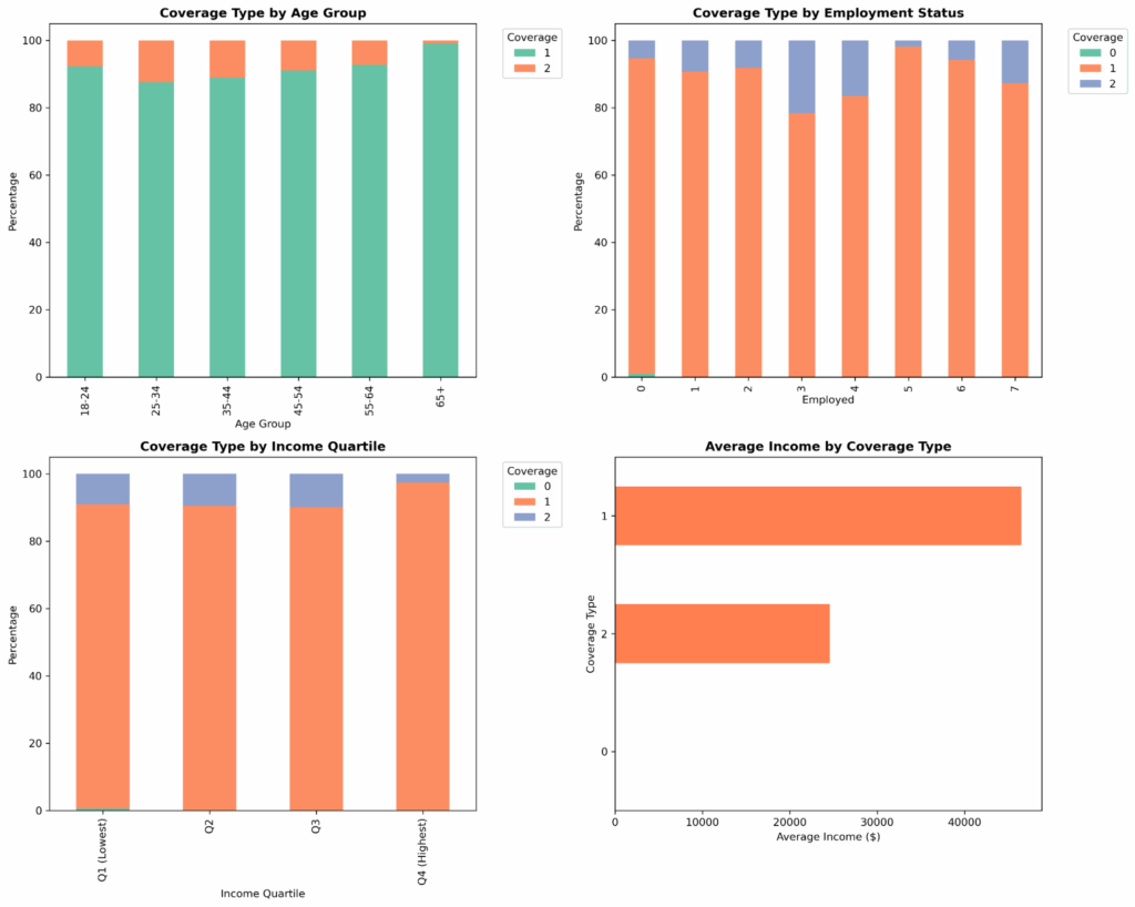
Step 4: Snowpark data transformation, modeling and evaluation
from sklearn.ensemble import RandomForestClassifier
from sklearn.model_selection import train_test_split
from sklearn.metrics import accuracy_score

# Create copy
df_model = df.copy()

# Create derived features
df_model['income_log'] = np.log1p(df['income'])
df_model['income_per_capita'] = df_model['income'] / df_model['family_size']
df_model['age_squared'] = df_model['age'] ** 2
df_model['is_senior'] = (df_model['age'] >= 65).astype(int)
df_model['is_young_adult'] = (df_model['age'] < 26).astype(int)

# Income categories
df_model['income_category'] = pd.cut(df_model['income'],
                                     bins=[0, 25000, 50000, 100000, float('inf')],
                                     labels=['Low', 'Medium', 'High', 'Very High'])

print(f"Created {len(df_model.columns) - len(df.columns)} new features")
print(f"Total features: {len(df_model.columns)}")- Income Log: Log-transform income based on your skew. Without this step, a few extreme values can dominate any distance calculations you will later run, and the model will struggle to learn patterns for the majority of the data.
- Income Per Capita: This adjusts income for family size by calculating per-person income, allowing us to more accurately understand the pressures of a family based on the income.
- Age squared: For tree-based models, like random forests, we can learn non-linear patterns without polynomial features (like squaring age, which we’re showing above.) However, this can help reduce the number of splits needed to capture the curve and make the pattern more explicit and easier to find. Age curves are fundamental to insurance pricing.
- Is Senior: Tracks age-related functionality in data that represents structural breaks in the market and may not be highlighted on a continuous curve. This shows the retirement age cliff where there could be discontinuity.
- Is Young Adult: Tracks a policy-driven market segment based on Affordable Care Act provisions for participants under the age of 26. Capturing policy points as a dummy variable, or as a binary indicator, allows for the model to learn distinct patterns for segmented groups.
- Income Categories: I’ve opted to bin income here because in this feature, we’re able to understand thresholds that are not captured in other parts of our feature engineering. Some analysis may not be displayed on a smooth curve and could, for example, show a coverage gap where policy, age, and income are not strategically supporting a group. We’re able to derive insights like “High-income individuals are X times more likely to have employer coverage” versus on a logarithmic basis where “each log-dollar of income increases odds by X points.” Both continuous and bin features are necessary to get a full picture, but these provide opportunity for narrative structure and predictions.
Setting up the modeling pipeline
Now that we’ve cleaned our data and engineered our features, we’ve visualized patterns. We can actually predict health insurance coverage from demographics.
from sklearn.preprocessing import LabelEncoder, StandardScaler
from sklearn.model_selection import train_test_split

categorical_features = ['education', 'marital_status', 'race', 'income']
numerical_features = ['age', 'income_log', 'family_size', 'employed',
                     'income_per_capita', 'age_squared', 'is_senior', 'is_young_adult']

# Encode categorical variables
df_encoded = df_model.copy()
label_encoders = {}

for col in categorical_features:
    le = LabelEncoder()
    df_encoded[col + '_encoded'] = le.fit_transform(df_encoded[col])
    label_encoders[col] = le

# Create feature matrix
feature_cols = numerical_features + [col + '_encoded' for col in categorical_features]
X = df_encoded[feature_cols]
y = df_encoded['hicoverage']

# Encode target variable
le_target = LabelEncoder()
y_encoded = le_target.fit_transform(y)
A note for how we’re handling income_log and income, two representations of income as both a categorical feature and a numerical feature, this may feel like feature duplication, but it actually highlights how different representations can capture different patterns. The continuous relationship, captured in numerical income, is a smooth gradual relationship. As income increases the probability of coverage increases gradually. This is what income_log (the continuous numerical feature) captures. Alternatively, income in categorical features will show patterns in how discrete thresholds may trigger changes in coverage eligibility. Different models benefit from different representations.
categorical_features = ['education', 'marital_status', 'race', 'income']
numerical_features = ['age', 'income_log', 'family_size', 'employed',
                     'income_per_capita', 'age_squared', 'is_senior', 'is_young_adult']

# Encode categorical variables
df_encoded = df_model.copy()
label_encoders = {}

for col in categorical_features:
    le = LabelEncoder()
    df_encoded[col + '_encoded'] = le.fit_transform(df_encoded[col])
    label_encoders[col] = le

# Create feature matrix
feature_cols = numerical_features + [col + '_encoded' for col in categorical_features]
X = df_encoded[feature_cols]
y = df_encoded['hicoverage']

# Encode target variable
le_target = LabelEncoder()
y_encoded = le_target.fit_transform(y)

# Split data
X_train, X_test, y_train, y_test = train_test_split(
    X, y_encoded, test_size=0.2, random_state=42, stratify=y_encoded
)

print(f"Training set: {len(X_train)} samples")
print(f"Test set: {len(X_test)} samples")
print(f"Number of features: {X_train.shape[1]}")
print(f"Coverage types: {le_target.classes_}")

# Scale features
scaler = StandardScaler()
#X_train_scaled = scaler.fit_transform(X_train)
#X_test_scaled = scaler.transform(X_test)

# Initialize models
models = {
    'Logistic Regression': LogisticRegression(max_iter=1000, random_state=42, multi_class='multinomial'),
    'Random Forest': RandomForestClassifier(n_estimators=100, max_depth=10, random_state=42),
    'Gradient Boosting': GradientBoostingClassifier(n_estimators=100, max_depth=5, random_state=42)
}

# Train and evaluate models
results = {}

for model_name, model in models.items():
    print(f"\n--- Training {model_name} ---")

    # Use scaled data for Logistic Regression, original for tree-based
    if 'Logistic' in model_name:
        model.fit(X_train_scaled, y_train)
        y_pred = model.predict(X_test_scaled)
        y_pred_proba = model.predict_proba(X_test_scaled)
    else:
        model.fit(X_train, y_train)
        y_pred = model.predict(X_test)
        y_pred_proba = model.predict_proba(X_test)

    # Calculate metrics
    accuracy = accuracy_score(y_test, y_pred)

    print(f"Accuracy: {accuracy:.4f}")
    print("\nClassification Report:")
    print(classification_report(y_test, y_pred, target_names=le_target.classes_))

    results[model_name] = {
        'model': model,
        'accuracy': accuracy,
        'y_pred': y_pred,
        'y_pred_proba': y_pred_proba,
        'y_test': y_test
    }

# Plot model comparison
plot_model_comparison(results, le_target)

# Return best model and encoders
best_model_name = max(results, key=lambda x: results[x]['accuracy'])
print(f"\n*** Best Model: {best_model_name} (Accuracy: {results[best_model_name]['accuracy']:.4f}) ***")

return results[best_model_name]['model'], le_target, label_encoders, scaler, feature_cols
We’re labeling our features, encoding them as numbers, and ensuring that we’re applying the same encoding as new data arrives. Next, we create the feature mix. We create a matrix for every variable we use to make predictions.
X = df_encoded[feature_cols]
y = df_encoded['hicoverage']
X is the design matrix for predictors and y is the response vector for outcome. Each row is a person, each column is a feature, and y tells us their actual coverage type. Then, we encode the target so we can translate the result.
Next, we split our data, following the golden rule: Never test on data you trained on. We set random_state=42 to help with debugging. If accuracy changes, it’s due to code changes and not random split variation—with a special nod to the answer to the universe: 42—and we stratify y_encoded to make sure that each parameter will match distributions between our train and test.
We scale for the distance-based algorithms: logistic, neural networks, support vector machine (SVM). In tree-based models, like random forest and gradient boosting, we don’t care about feature scaling. The splits work the same regardless of the distance between calculations. We create an if / else block to only scale for the logistic models.
Logistic Regression versus Random Forest versus Gradient Boosting
This trio of models represent three different modeling philosophies:
- Logistic regression: Fast to train and predict, regulatory friendly but assumes linear relationships and can underfit complex patterns
- Random forest: Handles non-linear relationships naturally and automatic feature interactions, but can be hard to explain to regulators and can overfit if individual trees are too deep or too complex.
- Gradient boosting: Achieve high accuracy, can capture complex patterns, but are slower to train than random forest and are sensitive to hyperparameters
Training, Evaluating and Classification Report
I opened up a for loop to train all three models: for model_name, model in models.items(): where we are able to scale for logistic regression, use raw data for tree models, and store predictions and probabilities.
Accuracy is the first metric we’ll want to look at, but that’s not enough. A classification report breaks down the precision of the people we predicted. We are then able to tell that the model is good at predicting a particular attribute but may struggle with predicting another. The implication is that we can confidently target one group for gap products, but we need more data or features to understand another group.
Finally, we save the model, accuracy, prediction, and probability calibration, and ground truth for further analysis and pick the winning model. Saving these values allows us further analysis for calibration, plotting, and creating confusion matrices, which will tell us how well our model is performing as we use it in the wild. In this, we picked the most accurate model as the “winner,” but production scenarios require more nuance. Your team may want faster predictions, more stable predictions, or simpler predictions.
This last line allows us to unlock putting our model into production:
return results[best_model_name]['model'], le_target, label_encoders, scaler, feature_cols- model: The trained classifier
- le_target: Decoder for predictions
- label_encoders: Encoders for new categorical data
- scaler: Standardization for new numerical data
- feature_cols: Exact feature order
Later, as we add new applicants and predict the coverage type with the new individual’s encoding, we can use what we’ve built to predict the coverage type. Without saving the encoders and scaler, the pipeline breaks.
We did it! I’ve created a Jupyter notebook to help you check your work.
Production Deployment: Enterprise Actuarial Platform
We’ve done it! We built a model pipeline and we’ve got a winning, working model to unblock us in our actuarial analysis. What does it mean to “deploy” this model and how do we maintain it?
To deploy it, we’re making it available for other systems to use. These can be scheduled jobs in a standalone Python script or REST API deployment that allows for real-time predictions, like in a Flask application. You can deploy that API and then use that API where the response gives predicted coverage, probabilities, confidence, model version, and when it was run.
To learn more about how Snowflake deploys models, check out this tutorial on deploying custom models to Snowflake’s model registry.
The Anaconda + Snowflake architecture scales to enterprise needs:
1. Model Governance
In production scenarios with billions of dollars of implications, models will have their own lifecycle. It starts with initial development where they are tested, deployed, and maintained responsibly. These also require an internal governance standard that can be programmatically enforced. The perks of enforcing some programmatically is that you’re able to create artifacts and version control your models. Consider creating a YAML file that includes the model version, creation date, data hashes, bias and validation results, and human-reviewed status, such as “APPROVED” or “UNDER REVIEW.”
2. Automated Model Refresh
Consider creating a Snowflake task in order to automate processing and optimizing business procedures to your model pipeline. For complex workflows, you can create multiple tasks called task graphs that can perform logic based on dynamic behavior.
The insurance industry relies on actuarial models to make billion-dollar decisions about pricing, reserves, and risk. Over time, without updating your models, you may find drift in data and misalignment in trends. It can underestimate life expectancy and underprice products.
3. Dataset Drift
For comprehensive monitoring of dataset drift, a common scenario where your real-world data may experience temporal changes, data collection changes, or shifts due to external events, you can set up statistical methods to detect data drift. Tasks and stored procedures in Snowflake are two methods to get on top of potential drift for production scenarios. Your team can set up automatic notification and alerting systems, set up monitoring for various tables, or create dashboard views for real-time drift status with a view of historical trends.
Conclusion: The Future of Actuarial Analytics
The combination of modern actuarial modeling, Anaconda’s Python ecosystem, and Snowflake’s cloud data platform represents the future of insurance analytics. This stack provides:
- Transparency: Every calculation is auditable
- Scalability: From single policies to millions
- Agility: Rapid model development and deployment
- Collaboration: Actuaries and data scientists using shared tools
Whether you’re calculating reserves, pricing new products, or performing regulatory reporting, this modern architecture scales from exploration to enterprise production.
Want to dive deeper?
- Read on to learn how Entercard accelerates credit risk modeling with Anaconda and Snowflake.
- Watch our video on automating data analysis with Snowflake and Anaconda.