This post is the second in a three-part series on the current state of Python data visualization and the trends that emerged from SciPy 2018.
In my previous post, I provided an overview of the myriad Python data visualization tools currently available, how they relate to each other, and their many differences. In this post we’ll take a look at an important theme that emerged from SciPy 2018: convergence, i.e., Python libraries becoming more similar in capability as they mature over time and share ideas and approaches. These trends of convergence have started to erase some of what were previous clear distinctions between each library. This is great for users, though it does make it more difficult to make blanket recommendations. As in the first post, we’ll generally separate the SciVis projects (typically 3D plotting situated in real-world space) from InfoVis projects (typically 2D plotting situated on the page or screen surface with arbitrary coordinate axes).
Image Output
JavaScript InfoVis libraries like Bokeh and Plotly have traditionally focused on interactive use in a web browser, and provided static output mainly as pixelated screenshots (and only with an internet connection, in the case of Plotly). Bokeh now supports PNG and SVG output, and Plotly graphs can be exported to PNG, SVG, or PDF via orca, so both libraries can now be used for publication-quality plots like the Matplotlib derivatives produce. Users thus no longer have to make a decision at the outset of a project about whether they will need to have scalable-resolution static outputs.
Big Data
Extremely large InfoVis data (more than 100,000 or a million points) previously required external Python or C data-rendering programs like Datashader and Vaex, but server-side data rendering has now been integrated into several JavaScript-based libraries so that they can be used interactively (using Vaex in bqplot and Datashader in HoloViews, GeoViews, hvPlot, and now Plotly). Thus there are now many alternatives for working with truly large InfoVis datasets in Python.
3D in Notebooks
OpenGL-based 3D libraries previously worked only in native GUI contexts, but Mayavi now supports limited use inside of Jupyter notebooks, making it possible to capture and disseminate workflows more readily, and complementing the browser-only 3D from ipyvolume and Plotly.
Widget/app support
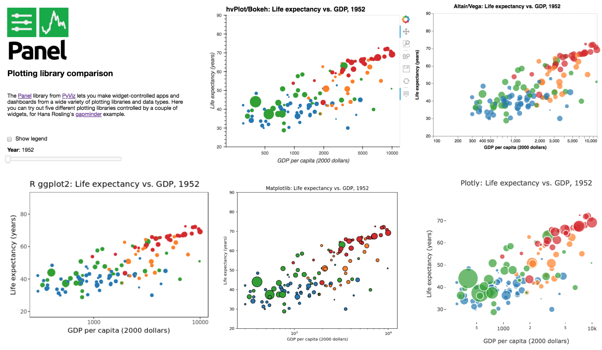
Previous mechanisms for providing widgets and support for apps and dashboards were often specific to Python plotting libraries, such as Dash for Plotly and Bokeh Server/Bokeh Widgets for Bokeh. A wide variety of plotting libraries now support usage with ipywidgets, making it feasible to switch between them or combine them as needed for particular notebook-related tasks relatively easily. This broad base of support makes the particular choice of ipywidgets-based library less crucial at the outset of a project. Many different plotting libraries can also be used with the new Panel app/widget library, either using the ipywidgets-style “interact” interface or as separate objects, either in a Jupyter notebook or in a separate server (see example app in the image above, which combines plots from four Python libraries along with R’s ggplot2).
De-facto .plot() API standard
The pandas plotting API has emerged as a de-facto standard for 2D charts, with a similar set of calls on Pandas dataframes now able to generate plots using Matplotlib (natively in Pandas), Vega-lite (via pdvega), Plotly (via cufflinks), or Bokeh (via hvPlot). hvPlot also provides the same plotting API for many other data libraries (xarray, GeoPandas, Dask, Intake, Streamz), making it possible for users in many cases to learn one set of plotting commands using Pandas and then apply them to a wide range of libraries to get either static or interactive plots.
What comes next?
These trends towards convergence mean that users who commit to a particular Python viz library or type of library are no longer entirely cut off from other types of functionality. Thus although the different histories and starting points outlined in the first blog post in this series remain important to understand, the implications are no longer quite as severe as in previous years. Still, having so many separate Python visualization libraries to choose from can still be confusing to new users, which is why I and other representatives of the Python visualization community spent time at SciPy 2018 discussing ways to simplify these libraries and steer users to a smaller number of starting points. To learn more about our visions for the future of Python dataviz, stay tuned for Part III of this series, Python Data Visualization 2018: Where Do We Go From Here?